
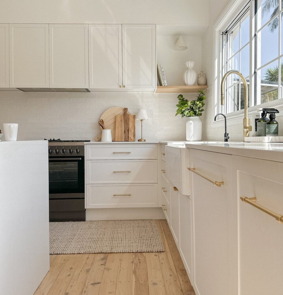

The palettes here run from an all-white kitchen and greige to forest green cabinets with white marble, deep red and jewel tones, and the light in your kitchen sets how far you can push.
Brush a sample onto a cabinet door and check it in daylight and under your evening bulbs, since the same green in matte and in gloss can look like 2 different colors.
1. All-white Kitchen
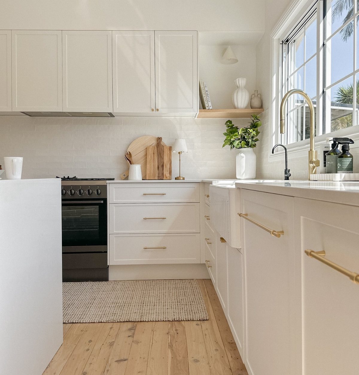
An all-white scheme gives you the brightest, cleanest baseline, and it reads as larger square footage than any other palette in small kitchens.
I use it in rooms that lack natural light, and in kitchens that need a reset after years of dark, dated finishes.
White costs you in maintenance.
White shows every fingerprint and grease splatter, so choose paint that wipes down easily. Satin or semi-gloss finishes hold up better than flat on walls near the stove or sink.
Vary the whites slightly to keep the room from feeling sterile. Cabinets in a cool white, walls in a warmer cream, and pale wood floors add enough contrast to make the space readable without losing the airy feel.
2. Blue and White
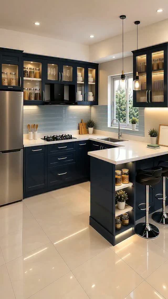
Navy or medium blue cabinets paired with white counters or walls balance color with brightness, and the combination feels traditional without being overly safe.
I reach for this when a client wants personality but still needs the kitchen to feel open and clean.
The ratio matters.
If you paint the lower cabinets blue, keep the uppers white or remove them entirely to avoid boxing in the space. In smaller kitchens, I reverse it: white below, blue tile or paint on the upper walls only.
The finish on the blue changes how the room reads. Matte navy feels contemporary, while gloss or satin skews more coastal or classic.
3. Black Kitchens
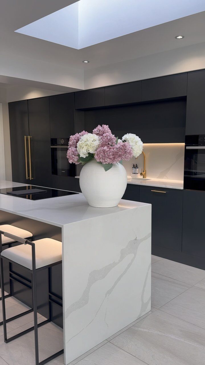
Black cabinets create immediate drama and work best in kitchens with strong natural light or high ceilings. The color absorbs light, so if the room is already dim or small, the space will feel even tighter.
Matte black hides fingerprints better than gloss, but both finishes show dust and streaks, so plan on frequent wiping.
I pair black cabinetry with white or light stone counters to keep some contrast and prevent the room from feeling like a cave.
This palette suits modern and industrial styles, but it also works in traditional spaces when the hardware and proportions stay classic.
If black feels too heavy, try it on just the island or lower cabinets and keep the walls and uppers light.
4. Gray and White
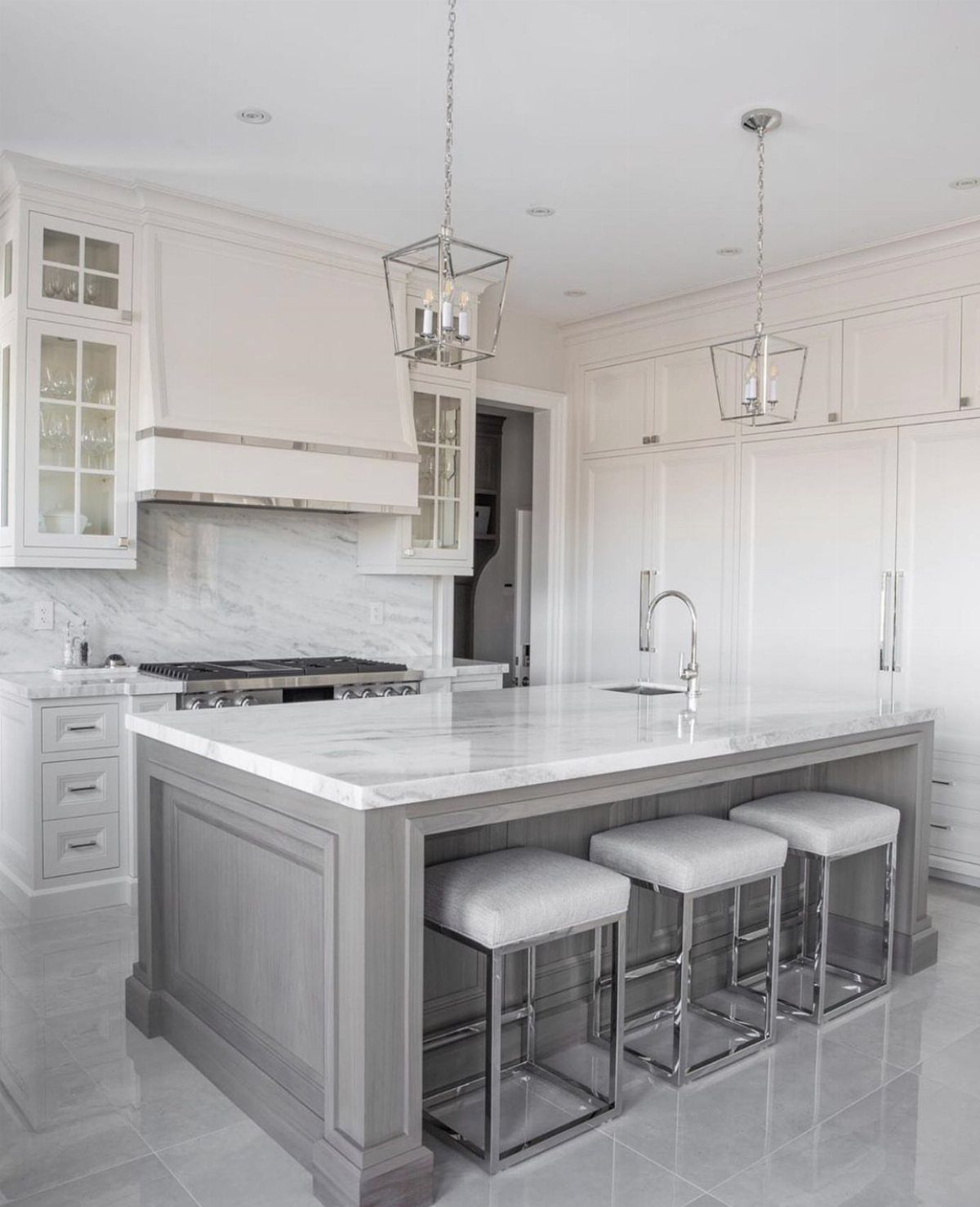
Gray and white is one of the safest modern palettes, and it suits nearly every kitchen layout and style. I use it when a client wants something current that won’t feel dated.
The gray can go on the island, the lower cabinets, or the walls, with white taking the rest.
I prefer gray on the island only, because it anchors the room without reducing the brightness. If the gray reads too cool, warm up the space with wood floors, brass hardware, or a warmer white on the walls.
This scheme works in rentals and resales because it offends almost no one, but that neutrality is also the downside. It can feel bland if you don’t add texture or a second material.
5. Beige and Wood
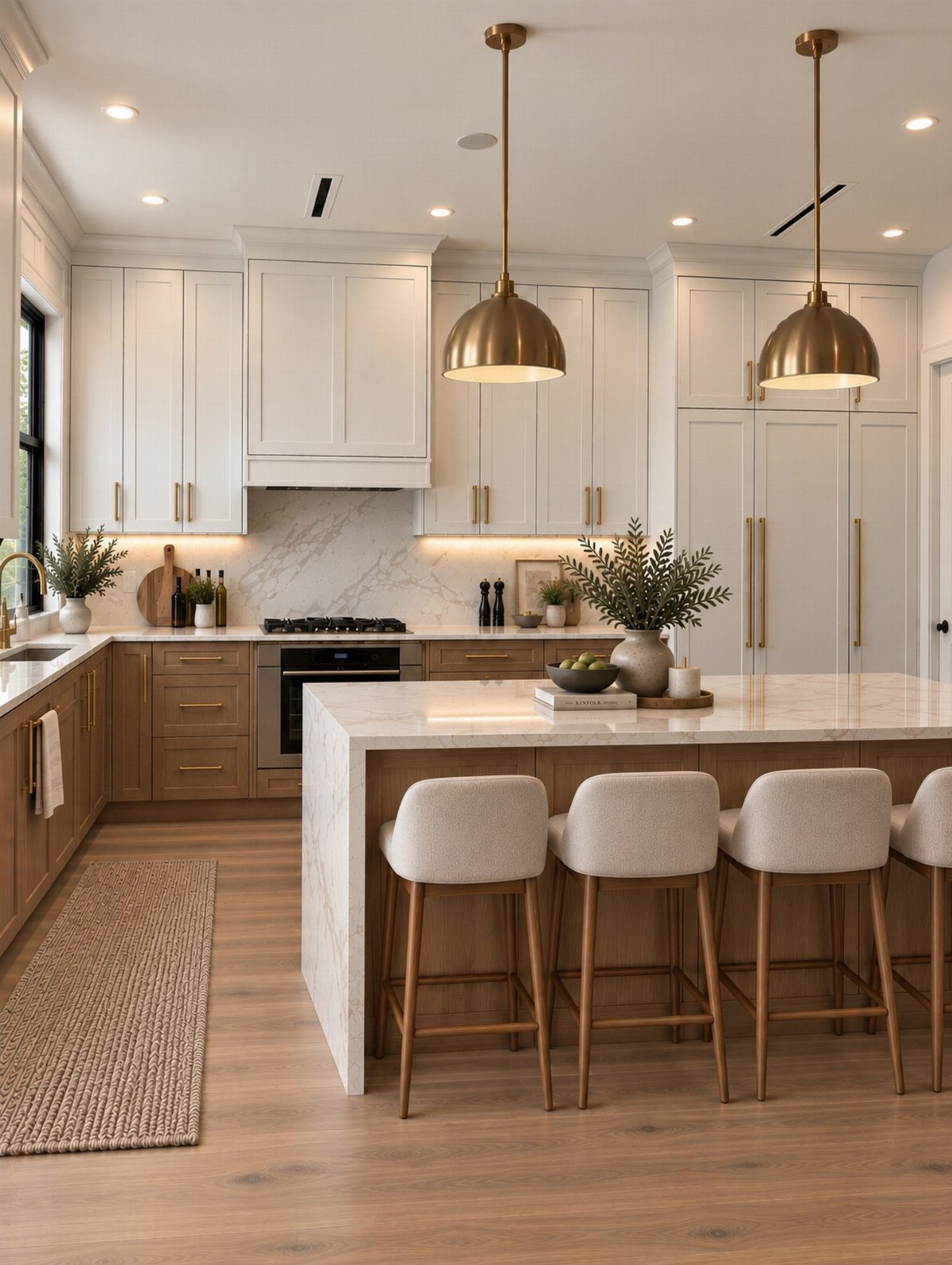
Beige, taupe, and cream with natural wood create a soft, warm palette that feels comfortable and livable.
I reach for this when the kitchen opens to a living area and needs to blend with the home instead of reading as a separate work zone.
Mixing wood tones helps: light wood cabinets below with painted cream or taupe uppers, or vice versa.
Keep one element lighter so the room doesn’t feel too enclosed. If everything is medium tone, the space loses definition.
This scheme suits transitional and Scandinavian styles, and it’s forgiving with kids, pets, and daily wear.
The downside is that beige can read as boring if the finishes are too uniform, so vary the textures with matte paint, natural wood grain, and stone or tile.
6. Pink and Green
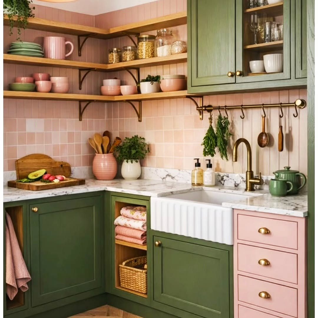
Pink and green make a high-contrast, joyful pairing; I’d keep it to small doses unless personality matters more than resale value in that kitchen.
I use this when a client wants something that feels vintage or playful and isn’t concerned about broad appeal.
The balance usually tips one way: green cabinets with pink tile or walls, or pink cabinets with green accents.
Equal amounts of both can feel busy, so pick one as the dominant color and let the other show up in smaller hits.
This palette suits cottage, eclectic, and maximalist styles, and it pairs well with brass or gold hardware and marble or wood counters. It’s a strong commitment, and if you tire of it, repainting is the only fix.
“Painting kitchen cabinets can come at quite an expense, so make sure to choose a color that you can live with long-term,” notes interior designer Dennis Brackeen of Dennis Brackeen Design Group in Houston.
7. Sage and Cream
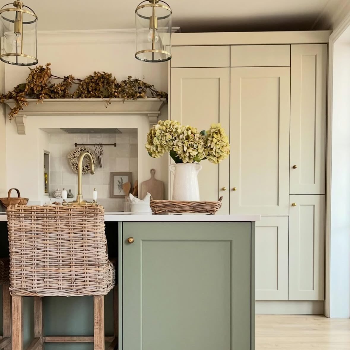
Sage and cream together keep the room light and serene without feeling sterile. The palette suits kitchens that need warmth but not boldness, and it works well in spaces where resale value matters.
I usually paint the island or lower cabinets in sage and keep the upper cabinets or walls cream or white.
This keeps the darker color grounded instead of floating around the room. If the sage goes on all the cabinets, use cream or white on the walls and add warmth with wood floors or brass hardware.
The combination suits traditional, farmhouse, and transitional styles. Sage reads greener in bright light and grayer in dim rooms, so test samples before committing.
8. Green and Red
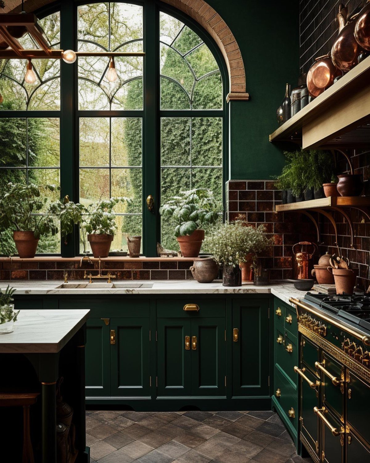
Green and red sit opposite on the color wheel, so the contrast is immediate and strong.
This palette works when the kitchen is large enough to handle 2 bold colors without feeling chaotic, and when the client wants something memorable over neutral.
The balance usually tilts toward one color. Let green cover the cabinets and walls, and keep red to the backsplash tile so it reads as an accent instead of competing with everything else.
If you reverse it, red walls with green accents, the room will feel warmer and busier.
This pairing suits vintage, eclectic, and maximalist styles.
9. Blue and Warm Wood
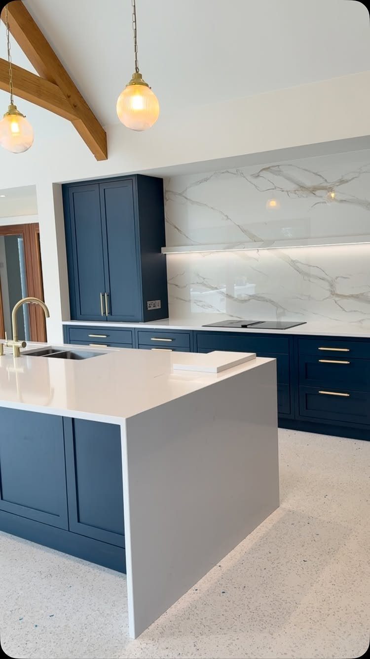
Adding warm wood to a blue and white kitchen softens the coolness of the palette and gives the room texture and character.
I use this when a client likes the brightness of blue and white but finds it too cold or minimal.
Wood can come in as beams, open shelving, butcher block counters, or floors.
Wood beams overhead add warmth without using any counter or storage space, which makes them a smart move in a small kitchen. If you’re working with a lower ceiling, wood floors or a wood island top give the same effect.
Coastal, modern farmhouse, and transitional rooms all take this blue and wood mix well. The wood tone matters: lighter woods feel Scandinavian, while darker walnut or cherry adds richness.
10. Black and White
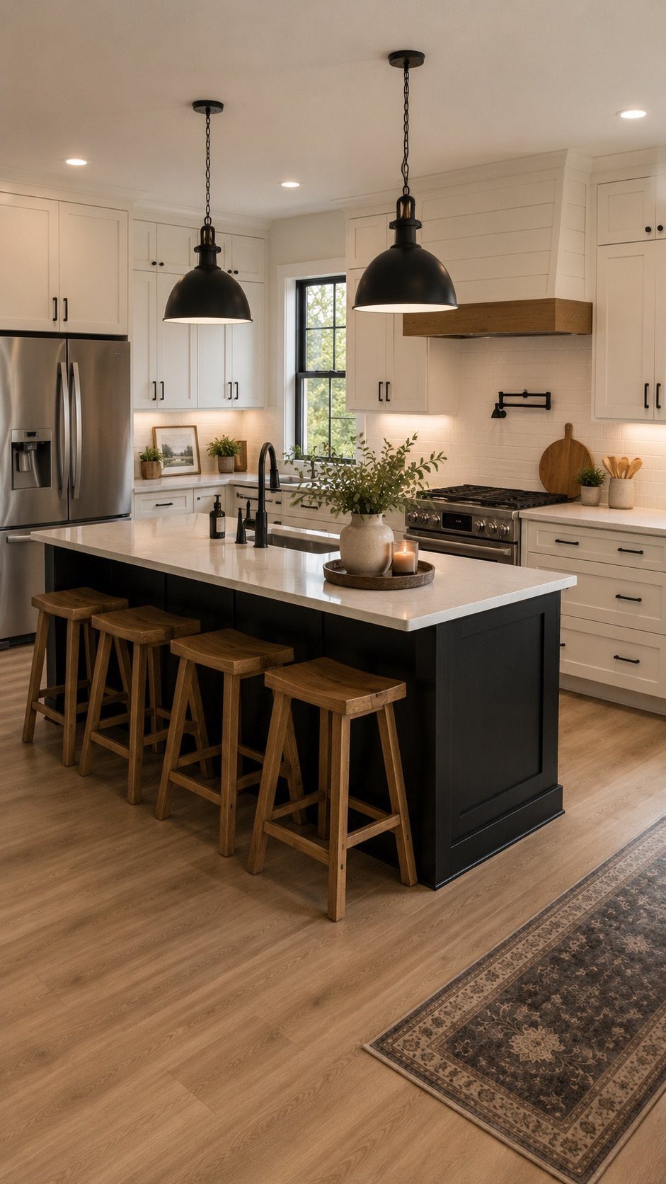
No other modern palette looks as crisp as black and white, and the graphic contrast holds up in almost any kitchen layout.
I’d pick it for anyone who wants high contrast and can live with a room that leans a little stark.
Proportion decides how the room feels.
Black on the island or lower cabinets with white uppers and walls keeps the space bright. If you paint all the cabinets black, the room needs excellent natural light or it will feel heavy.
Modern, industrial, and Scandinavian kitchens all wear this palette well.
Add wood floors or warm metal hardware if the contrast feels too cold. Black shows dust and fingerprints, so plan on frequent cleaning.
11. Soft Green Cabinets
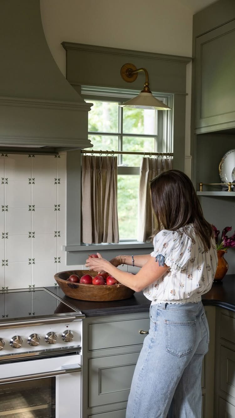
Soft green cabinets in shades like sage, mint, or pale olive give the kitchen a calm, grounded feel without the boldness of darker greens. This color suits kitchens that need personality but still want to feel open and airy.
Gloss and matte versions of the same green can look like 2 different colors.
Matte feels contemporary and hides imperfections, while satin or semi-gloss reflects more light and suits traditional styles. A green that leans cold warms up fast with wood counters, brass pulls, or cream walls.
This palette works in small and large kitchens, and it’s forgiving with resale because the color isn’t polarizing. White or pale stone counters keep the room bright.
12. Blue on Blue
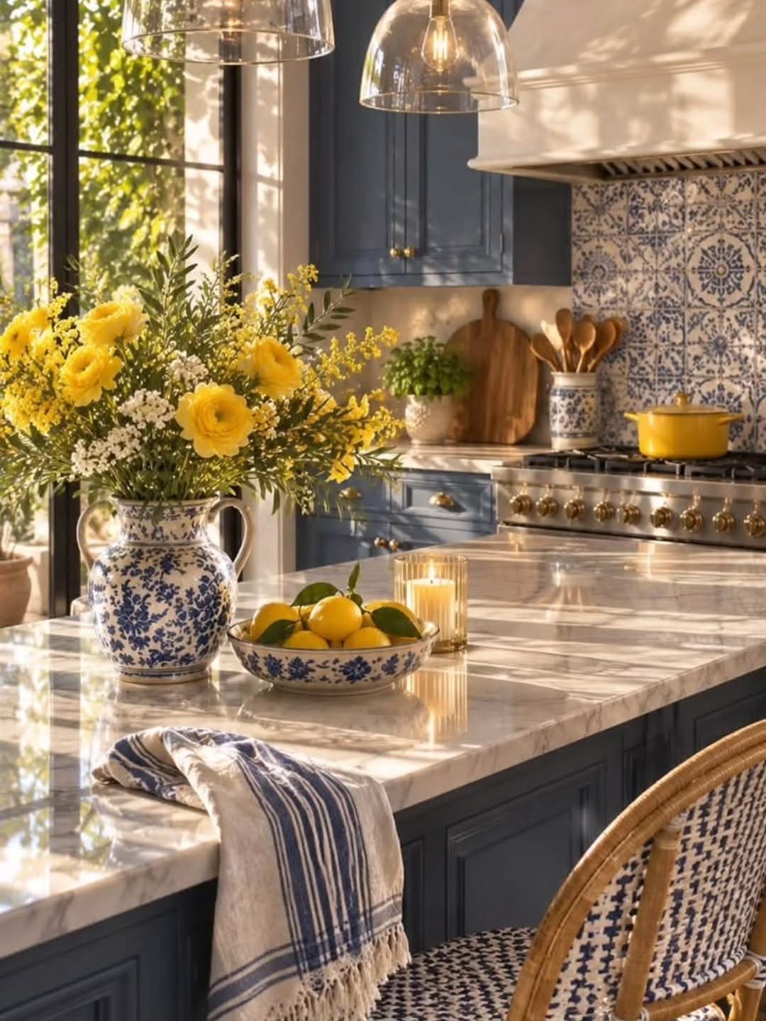
Using multiple shades of blue creates depth without introducing new colors, and the result feels cohesive and intentional. I use this when a client loves blue and wants a kitchen that feels immersive but not monotonous.
The tones need enough contrast to stay readable.
Navy cabinets with a lighter blue tile or pale blue walls keep the layers distinct. If the blues are too close in value, the room flattens and loses definition.
Pattern helps.
Patterned blue and white tile breaks up large solid surfaces, so it works best where the cabinets and counters are plain. Traditional, coastal, and transitional kitchens all suit this palette, especially with white marble, brass, or wood accents.
13. Bright Blue
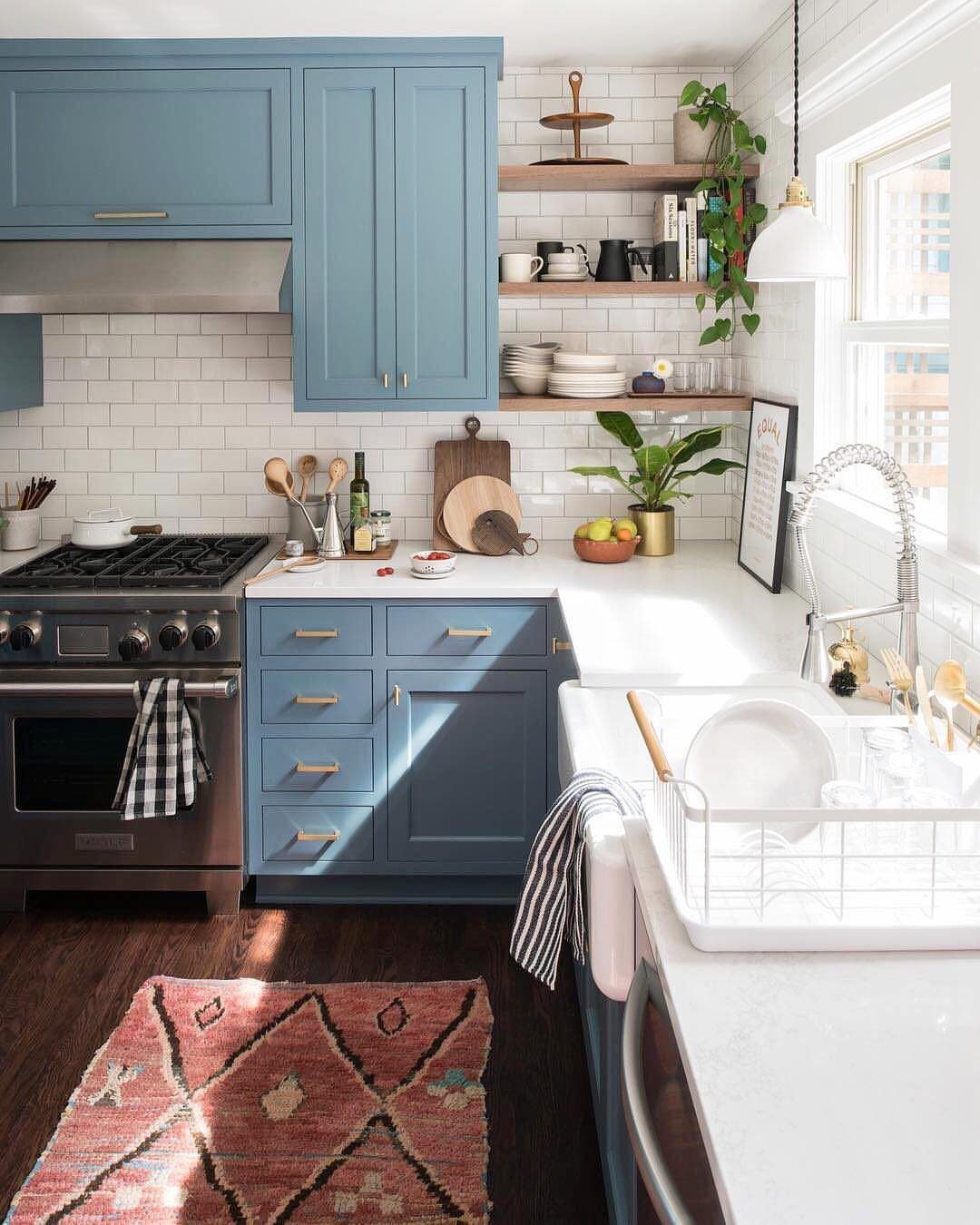
Vivid blue cabinets give a kitchen a cheerful, comforting center, and white counters with a white tile backsplash keep that much color from feeling heavy. For a weekend repaint, this is one of the more forgiving bold choices.
Keep the surrounding surfaces quiet and let the cabinets carry everything.
Bright blue can read cold on its own, so pair it with warm wood, like open shelving in a honey or walnut tone. I’d pick a satin finish, since it wipes clean and shows the color without glare.
If a full wall of bright blue feels like too much, paint only the lower cabinets.
14. Warm Gray
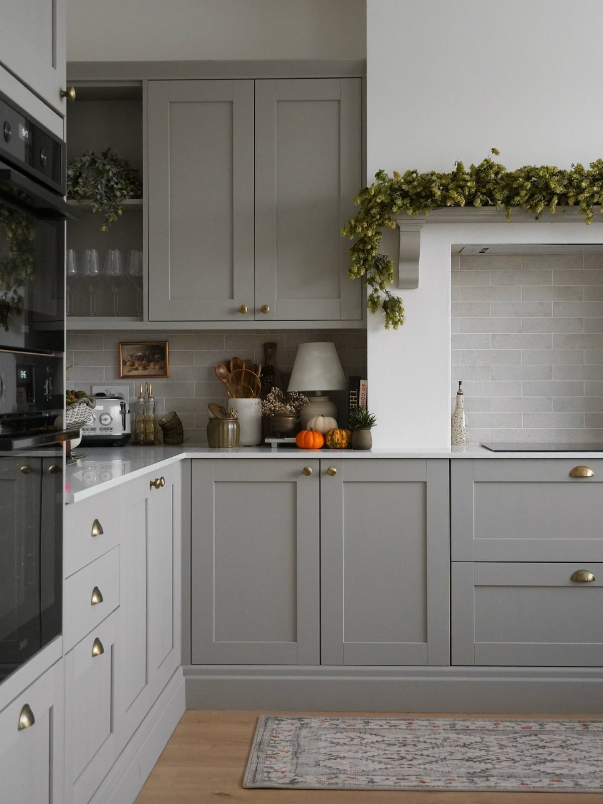
Gray with a touch of beige or brown in it avoids the chill that plain gray can bring, which is why warm gray works so well on shaker cabinets.
It’s my pick for anyone who wants gray but dislikes how clinical it can feel.
Brass-toned pulls add a warm glint, and keeping the counters and backsplash white stops the gray from feeling dim.
Brush a sample onto a cabinet door and check it in morning and evening light, then commit to a full gallon, since undertones shift through the day.
Greenery on the counters adds a fresh contrast against the gray.
15. Dark Teal
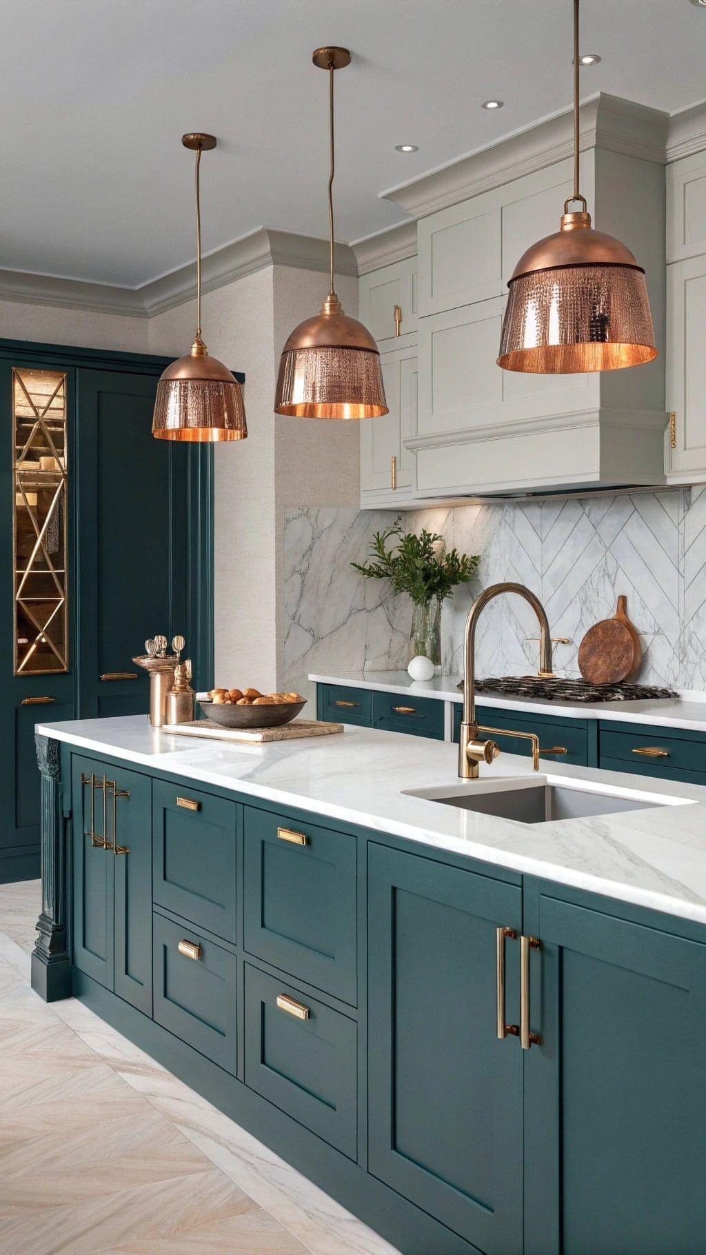
Dark teal on the lower cabinets and pantry gives a kitchen an earthy, outdoorsy mood that deep navy and black can’t quite match. White marble counters and lighter upper cabinets keep it from closing in.
Painting only the base cabinets and the pantry is also the cheaper route, since you cover less surface.
Copper pendants are a good match because their warm metal glows against the cool green-blue. Choose a satin or semi-gloss finish for the lowers, where splashes and scuffs happen most.
Fair warning: dark paint takes extra coats, so give yourself a full weekend.
16. Greige
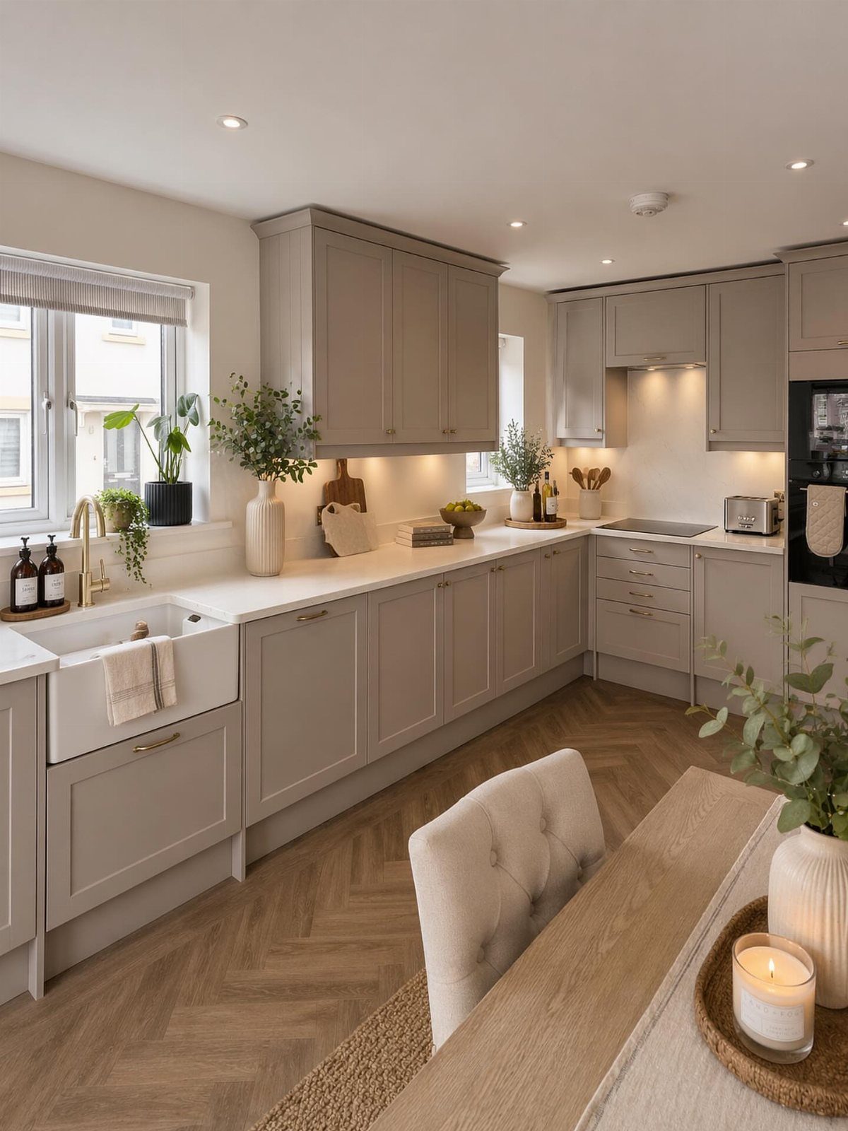
Greige sits between gray and beige, so it reads as a quiet neutral that never fights with what’s already in the room.
It’s the color I’d choose for cabinets when the floors and counters are fixed and you just want them to look intentional together.
White counters keep the look crisp.
Greige swings gray or tan depending on the light, so brush a sample patch near the window and next to the stove before committing. A good paint swatch costs far less than repainting.
17. Cream and Wood
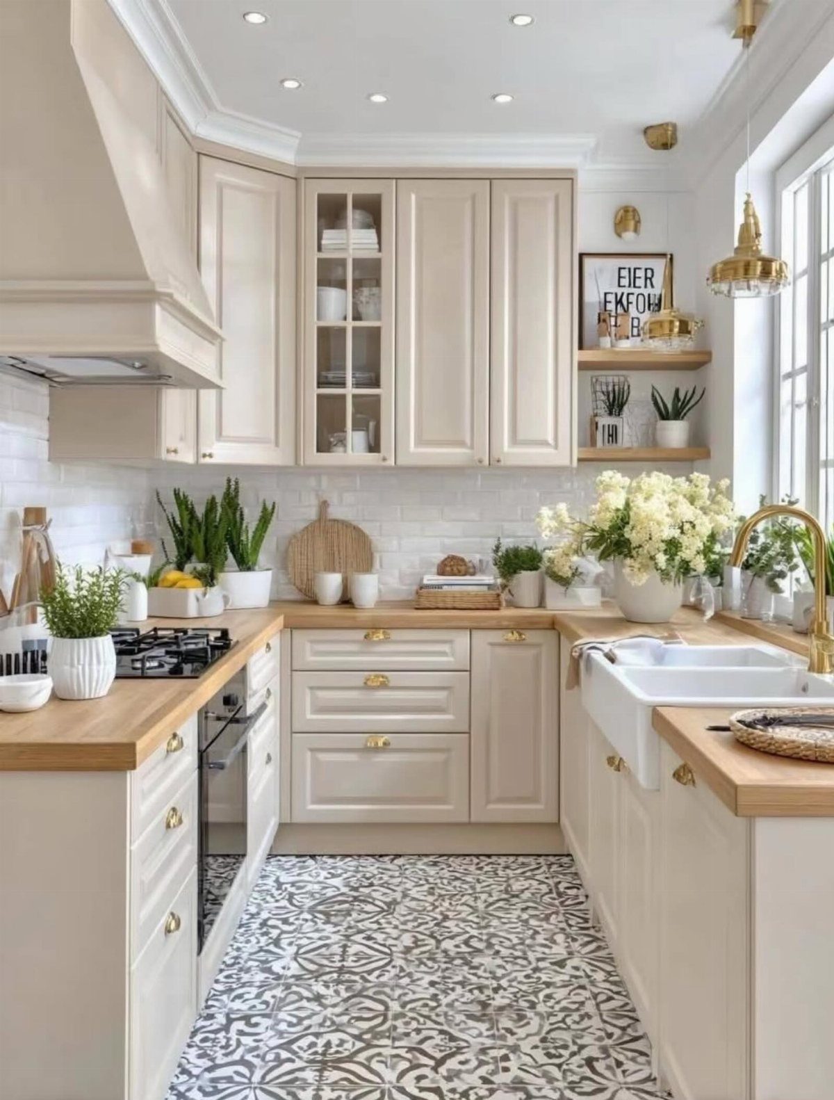
Cream cabinets with light wood counters make a soft, soothing kitchen, and it’s an easy palette to live in every day. Cream is warmer than white, so it flatters wood instead of competing with it.
Patterned gray floor tile does useful work here: it adds a cool note and some visual interest so the cream and wood don’t blur into one beige mass.
If your floors are plain, a patterned rug can do the same job for less money.
I’d paint the cabinets in satin and seal any raw wood counters so they handle water.
18. Black and Wood
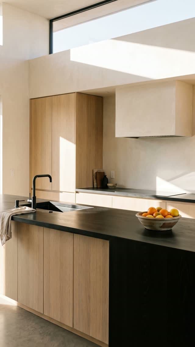
Black counters against light wood cabinets give a kitchen a bold, graphic punch without painting a single wall dark. The wood keeps the room warm while the black draws the eye straight to the island.
This pairing suits a renter or first-time owner who wants contrast but dreads a heavy, dark room. Keep the walls light and add a black faucet to repeat the counter color, so the black feels planned rather than random.
If the counters are fixed, you can echo them cheaply with black pulls, a lamp, or a framed print.
19. Olive Green and Wood
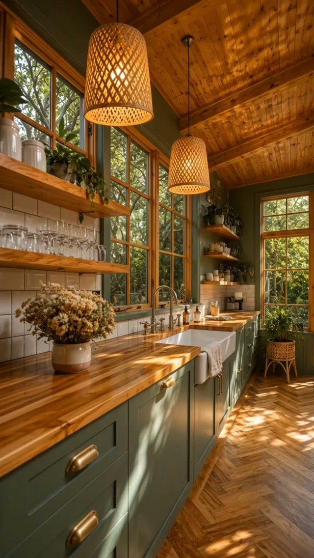
Olive green on the lower cabinets, with wood counters and open wood shelving, gives a kitchen a grounded, earthy base.
Olive is muted enough that the wood never has to fight it, and the two warm tones read as one family.
I’d keep the uppers and walls light so the green stays on the bottom half of the room. A black faucet or black pulls sharpen the look and keep it from sliding into all-brown.
Woven pendants add one more natural texture for very little money.
20. Jewel Tones
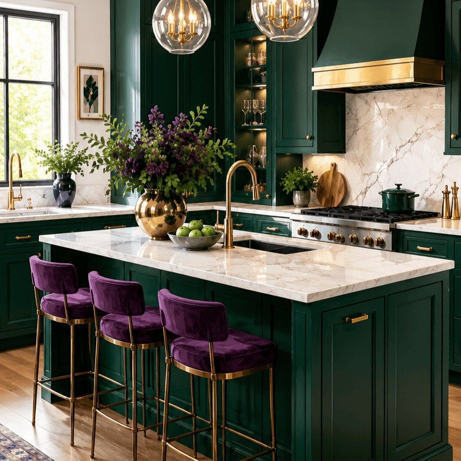
Jewel tones turn a kitchen into the most colorful room in the house.
Keep the big surfaces to one jewel color and let a second one show up in small pieces, like velvet barstools in purple. 2 saturated colors in large doses will fight.
Paint is the cheap way in: one deep color on the cabinets, then swap stools or hardware to push the mood further.
21. Forest Green Cabinets and White Marble
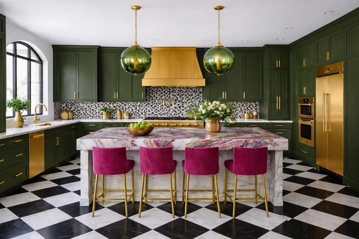
Forest green is a heavy color, and white marble is what stops it from closing in the room. The pale stone bounces light back, so the cabinets can stay deep without making the kitchen feel like a cave.
A black and white checkered floor adds crisp pattern underneath, and brass or gold finishes tie into the green nicely.
For a bolder accent, hot pink or magenta on a few stools pushes the contrast against green, and it’s easy to swap out if you tire of it.
Marble is a real investment, so a white laminate or quartz look-alike gets you most of the effect on a tighter budget.
22. Deep Red Kitchen
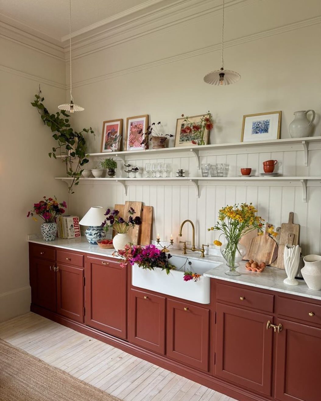
Deep red lower cabinets set against a cream wall make a kitchen feel warm and rich in a way few colors manage. Cream is the right partner here: it softens the red where white would turn the contrast sharp.
White counters or a white farmhouse sink keep the red from taking over.
Fair warning: red is a commitment, and a strong color like this may need extra coats to cover evenly.
23. Pink and Florals
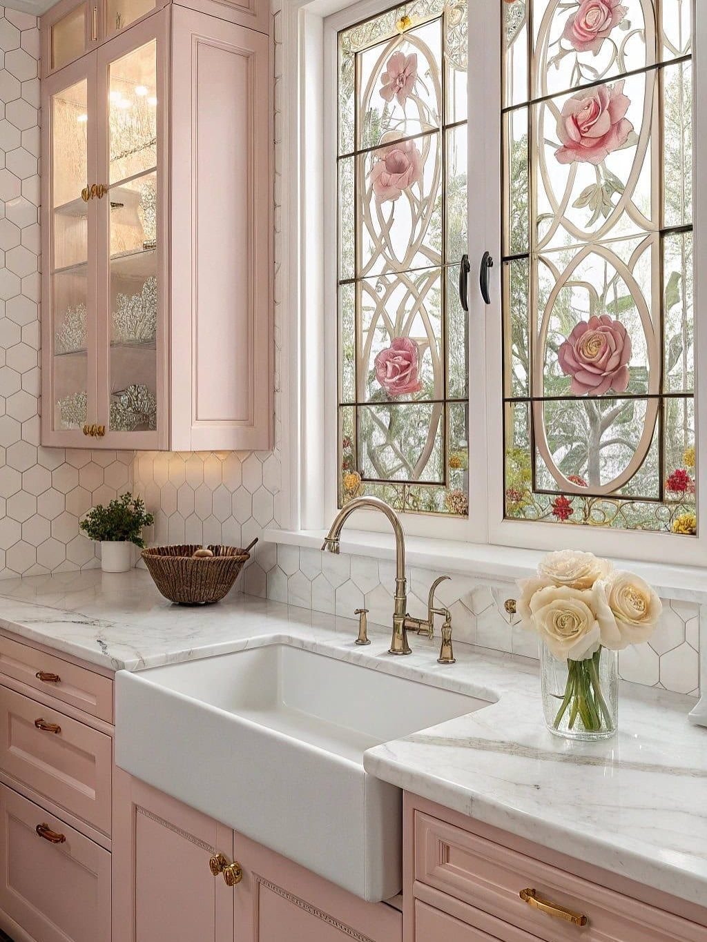
Pastel pink cabinets can look flat on their own, which is why a little pattern helps. A floral touch, whether stained glass in a window, wallpaper, or a vase of roses, gives the soft color something to play against.
Pick a pink with a hint of warmth, and test it on a door before buying a full gallon.
A renter can get the same effect with floral curtains or a framed print, no repaint needed.
24. Salmon Pink
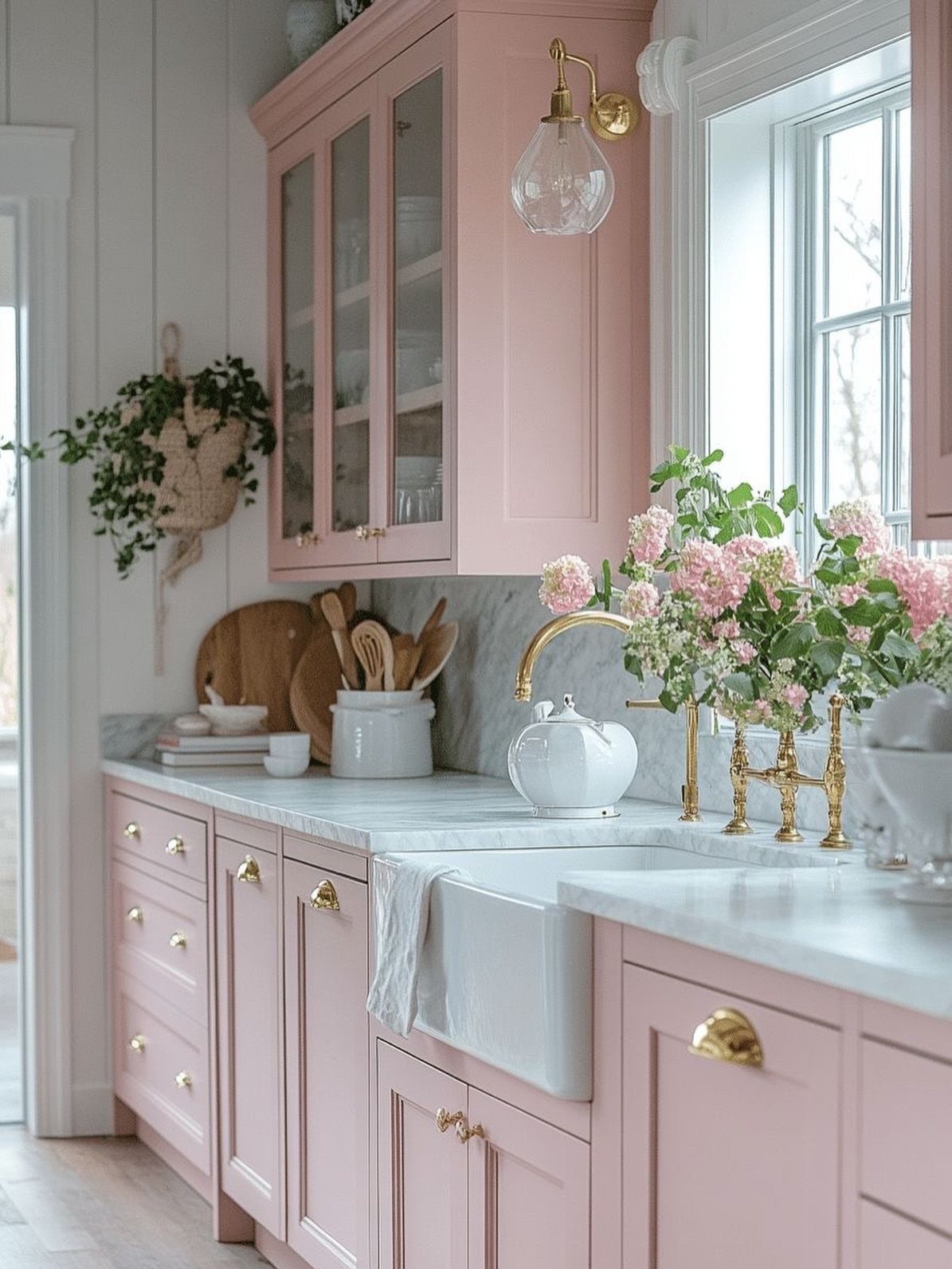
Salmon pink has orange in it, and that peachy warmth pulls the eye harder than a pale pastel does. If you like pink but want the cabinets to be the star of the room, this is the version I’d choose.
Salmon leans orange, so a warm white on the counters and walls works better than a stark one, and brass or gold pulls echo the peach. Fresh pink flowers on the counter echo the cabinets without adding another paint color.
Test a sample first. Salmon can drift toward orange or toward pink as the daylight changes.
25. Pink and Black
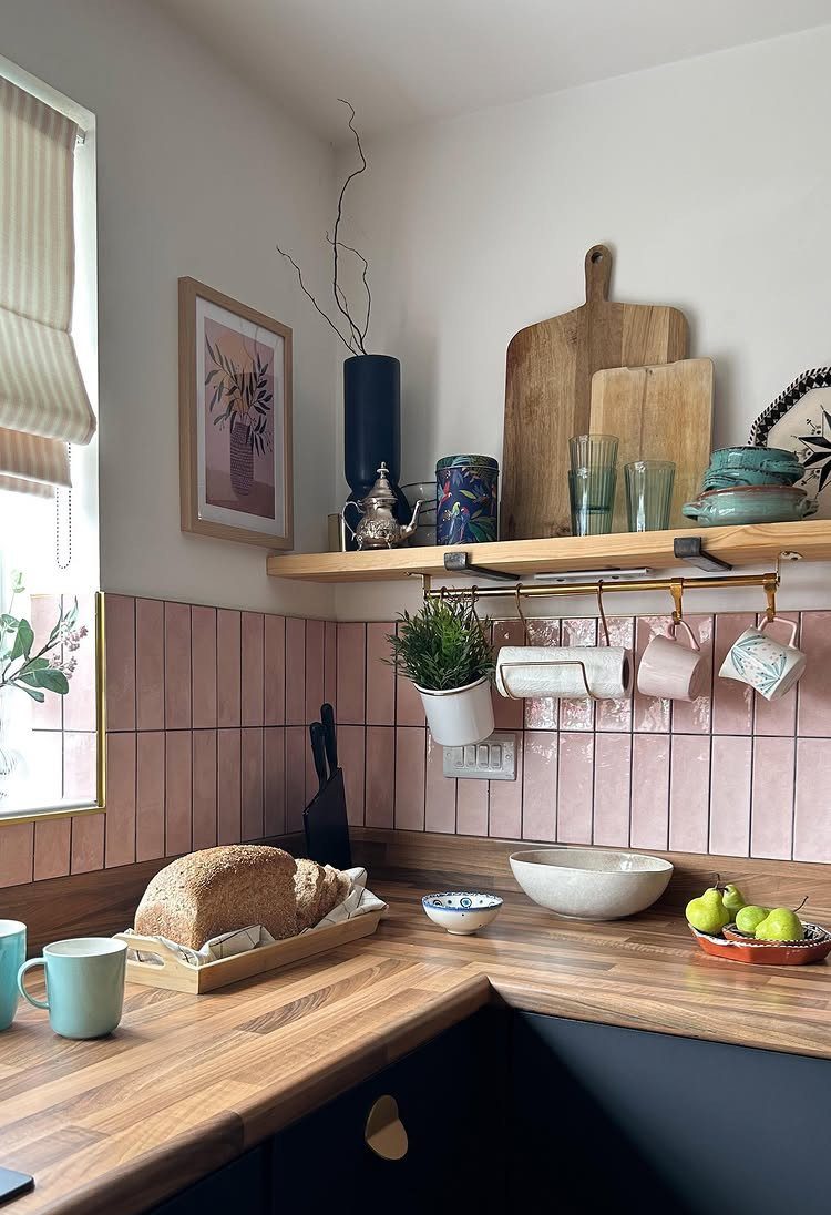
Pink tile with dark lower cabinets works because the black grounds a color that could otherwise drift sweet. The wood counter and open shelf sit between the two and keep the contrast from feeling harsh.
For a quick, cheap version, paint only the lower cabinets in a deep shade and leave the walls pink. Satin holds up best on the doors people touch and bump daily.
If tile is already pink and you can’t change it, dark cabinets are the single repaint that makes it look intentional.
26. Blue-black Kitchen
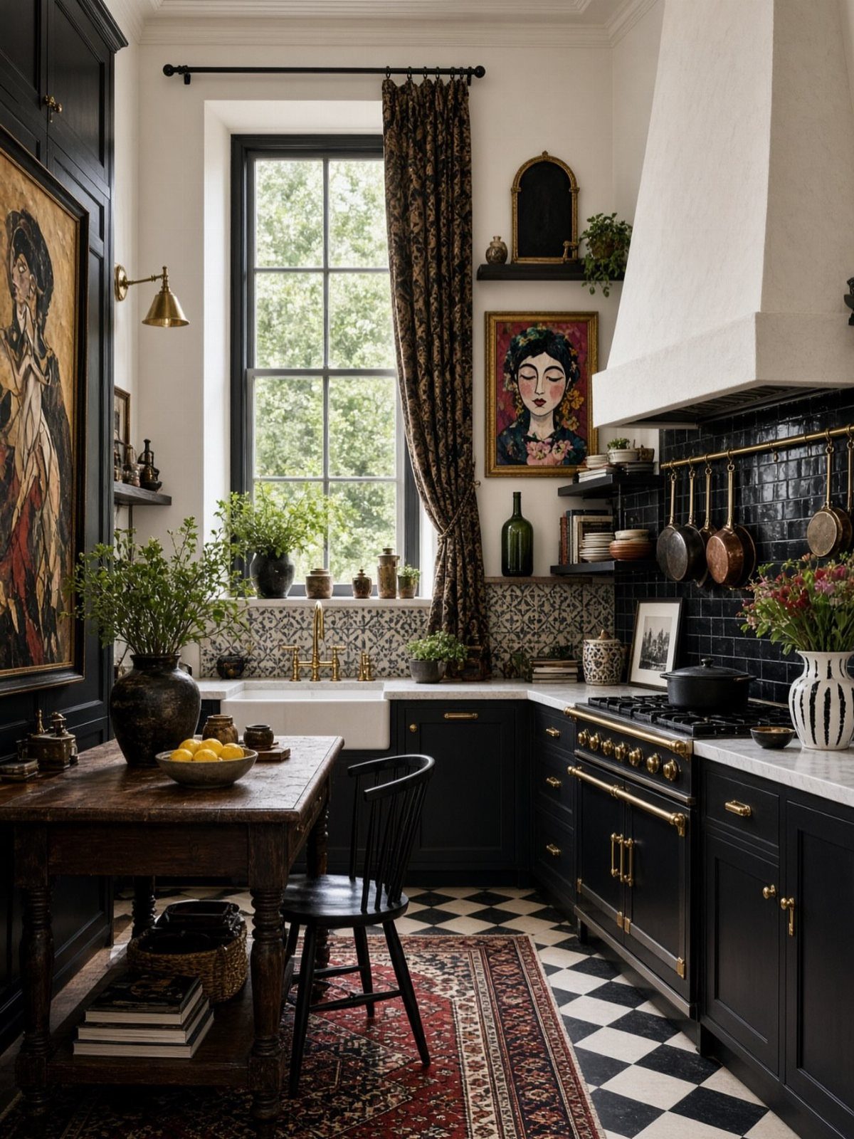
Blue-black is a softer move than true black: it reads as dark at first glance, then shows a hint of color when light hits it.
That makes it a good moody background for a room full of pattern, like a checkered floor and a bold rug.
Keep the walls and tile in the same deep family so the cabinets recede instead of shouting. A warm wood table and a big window with curtains stop the darkness from feeling like a cave.
Brush a sample onto a door and look at it at night, since lamplight changes dark colors more than daylight does.
27. Historic Blue
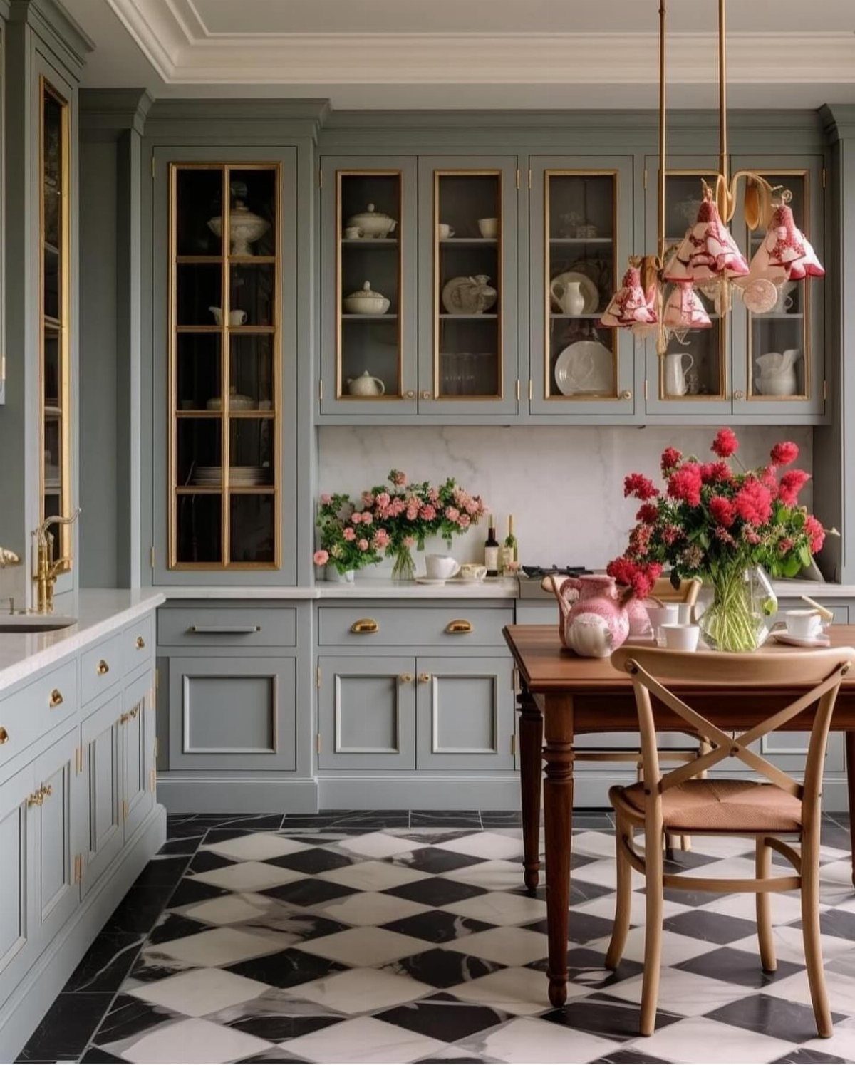
Historic blue is a muted, grayed shade that makes painted cabinets look old-house appropriate without feeling dated. Gold hardware suits it well, and it’s the pairing I’d choose over chrome for this color.
Because the blue is quiet, a busy floor like black and white checks can carry the pattern while the cabinets stay calm. Fresh flowers on the table add a soft contrast.
Pick this one if you want something traditional that still looks fresh. Test a swatch in your own light first, since grayed blues can lean green or purple depending on the window.
28. Canary Yellow and Blue Kitchen
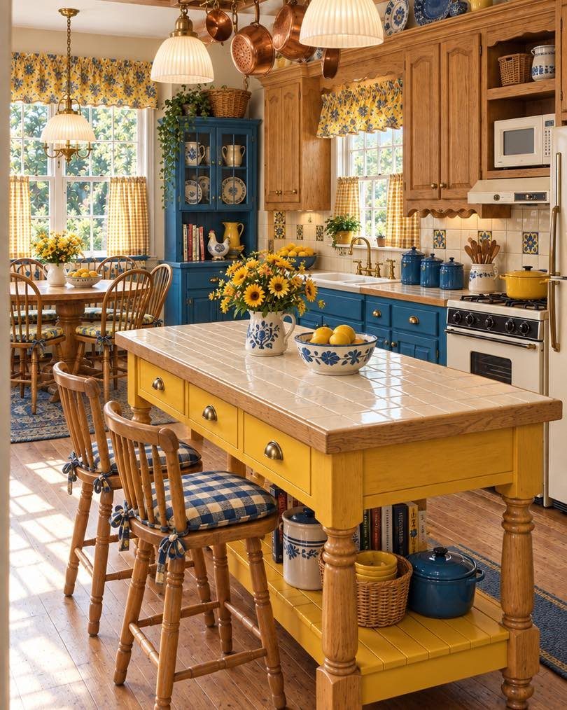
Blue cabinets with a yellow island is a high-color pairing I’d save for a kitchen that has room to carry it, because the contrast is strong and both colors read brighter side by side.
Giving one color the larger share keeps it from looking chaotic: here blue takes the walls of cabinets and yellow gets the island.
Yellow curtains repeat the island across the room, which ties the scheme together for little money. A renter can skip the repaint and get close with curtains and a few blue and yellow accessories.
Choose a warm white for the remaining surfaces so the 2 colors do the talking.
29. Sunny Yellow Kitchen
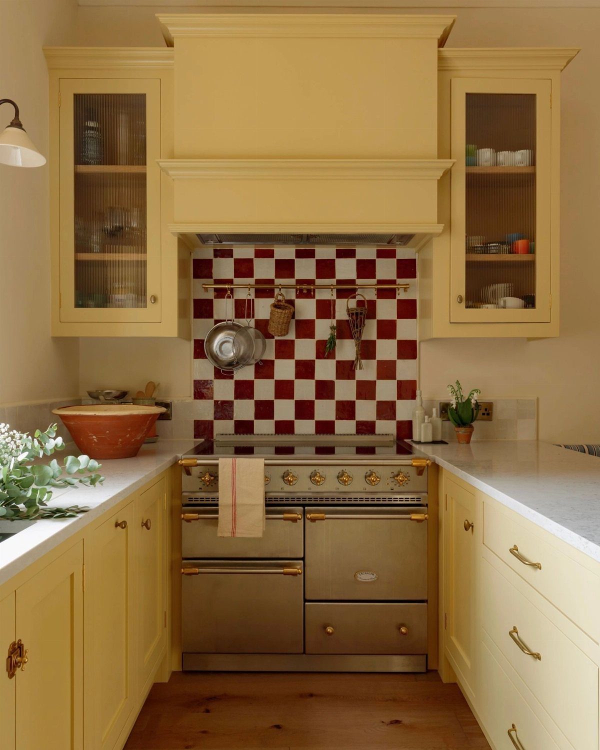
Sunny yellow cabinets bring daytime energy into a kitchen, and a pale, buttery shade reads friendlier than a hard lemon.
A red and white checkered backsplash gives the yellow a classic diner partner, and white counters keep the whole thing clean.
Yellow can look flat if you pick it from a tiny chip, so brush a large sample and check it near the stove and the window before buying a gallon.
Yellow often needs more than one coat to cover evenly, so plan on at least a weekend.
Painting only the base cabinets gets you most of the color for about half the work, and a quart or 2 usually covers a small kitchen.
Choosing Color and Finish
Start with what can’t change. Countertops, flooring, and the paint in the rooms next door set the undertones your new color has to live with, so hold sample chips against them before you think about mood.
Then decide how you want the room to feel, whether calm, energetic, or cozy, and use that to cut your list down to 2 or 3 colors.
Paint a large sample and leave it up for 24 hours. Morning light, afternoon light, and lamps at night will each pull the color somewhere different, and clashing undertones show up fast beside your fixed surfaces.
Water-based paints come in matte and eggshell, both soft and low-glare. Shaker doors and sleek high-gloss slab doors both take color well, so door style shouldn’t talk you out of a shade you like.
Small Kitchen and Lighting
Small kitchens give you a real choice. Whites, light grays, and pastels reflect more light and make the room feel more open, which is the safer route if the space is dim or you plan to sell soon.
The other route is going bold. A small footprint means less surface to commit to, so yellow, mauve, or green can be a worthwhile gamble.
I’d let the light decide.
With a good window and decent ceiling height, bold color has room to work. Without them, stay light.
Dark colors used everywhere can turn gloomy and shrink a room. Strong natural light and high ceilings are what let a darker shade hold up.
Paint Cost and Safety
Repainting is one of the cheaper ways to change a kitchen, and basic DIY skills cover it. Paint, primer, brushes, and rollers cost far less than replacing the cabinets.
Choose low-VOC paint. It limits the harmful fumes that wet paint gives off, which matters in a room where you prepare food.
Kitchens run humid and collect cooking grease, so degrease surfaces before you start. Keep windows open or a fan running while you paint and while it dries, and hold off on heavy cooking until the smell fades.
Frequently Asked Questions
What is the best color for a kitchen?
White is the safest answer.
It gives the brightest, cleanest base, and designers still call it timeless. Pairing gray with white is a safe modern route too, and it fits most layouts without much fuss.
If you want more color, designers point to green, deep blue, jewel tones, dark moody shades, and taupe or greige. Match the shade to your light, since deep colors like black make a dim room feel tighter.
What is the best color for a small kitchen?
Go with white: it reflects the most light, so the walls and cabinets seem to sit farther back.
Light gray and pastels reflect plenty of light too. Bold colors still work: designers suggest teal, yellow, mauve, or green.
A blue and white kitchen stays open if you keep white on the lower cabinets and put the blue on the upper walls only. Black cabinets are the one choice I’d skip in a small, dim room.
Should I paint my kitchen cabinets a different color than the walls?
Yes. Contrast adds depth, and the usual move is darker cabinets against lighter walls, as long as the 2 colors complement each other.
Sage on the lower cabinets or island with cream or white walls is a good example, because it keeps the darker color grounded.
Tight rooms do better in reverse, with white base cabinets and the color painted higher up on the walls.
Can I use bold colors in a modern kitchen remodel?
Yes. Charcoal or navy look strong on cabinets, an island, or an accent wall.
Matte navy reads contemporary. Black works best as an anchor, like an island or a run of base cabinets, with pale walls and upper cabinets so daylight still reaches the room.
What colors work well with natural wood in the kitchen?
Soft neutrals like beige, taupe, and cream sit best next to natural wood, and muted blues and greens work well too.
Olive base cabinets next to butcher block counters and open wood shelves give the room a settled, earthy feel. Vary the textures too, so a beige scheme doesn’t turn flat.
What color is replacing gray in kitchens?
Warm gray and greige are the closest swaps.
Both carry some beige or brown, so they skip the clinical chill of plain gray. Sage with cream is another light option that moves away from gray.