
Whether you rent or own decides which of these kitchens is realistic.
A renter can get the look from a plug-in chandelier, potted basil on a sunny sill or terracotta-toned pots, while an owner with a remodel budget can commit to cotto floors, an apron-front sink or a marble waterfall island.
Pick from the end of that range your lease and budget allow, then borrow the colors and materials from the other end.
1. Terracotta and Olive Kitchen
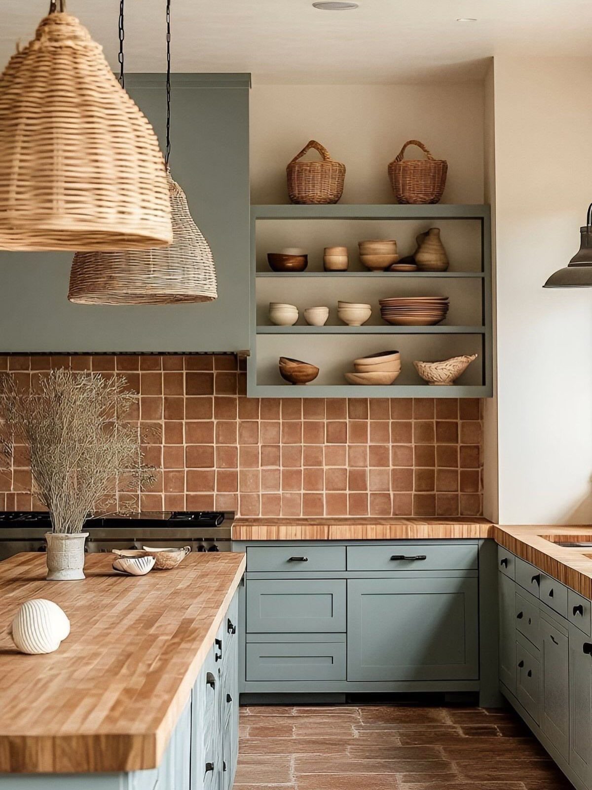
Olive and terracotta get along because both lean earthy and warm, so neither fights the other. Wood countertops add a third warm layer between them.
Keep the walls plain and let the cabinets and tile do the talking.
If new tile is out of budget, olive paint on existing cabinets gets you much of the look, and a few ceramic bowls on open shelves can supply the terracotta tone.
2. Exposed Wood Beams
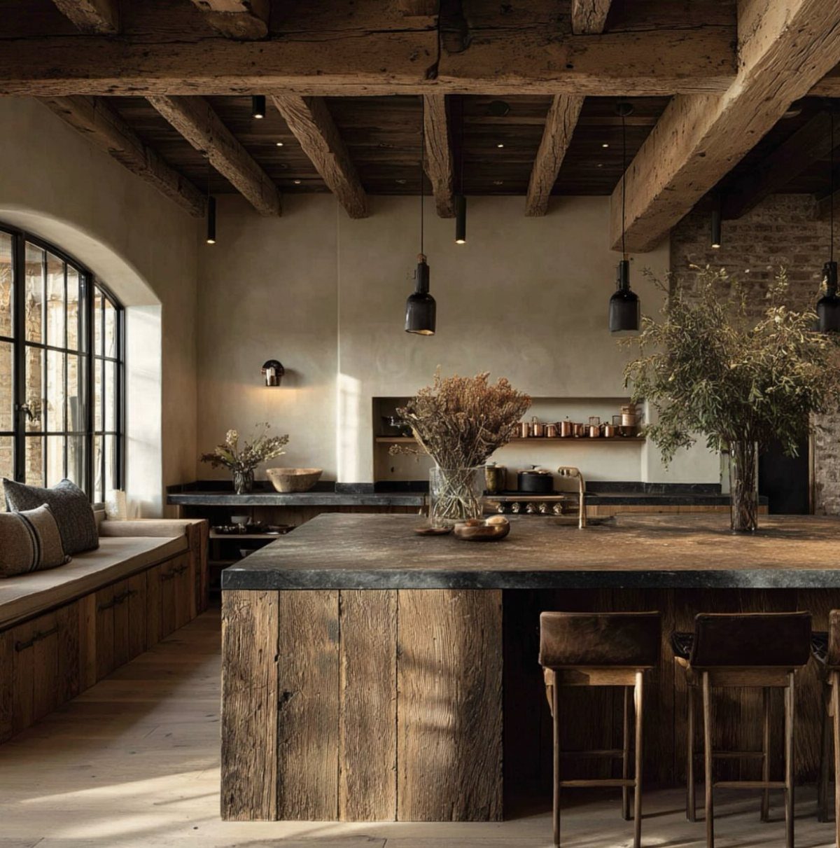
Heavy ceiling beams set the mood for the whole room, so I would let them be the main event. A dark island, wooden stools and a brick wall all share their weight and age.
Keep the walls and upper cabinets lighter so the ceiling doesn’t press down.
If your ceiling has no beams to expose, wood-finish faux beams give a similar look. Real beams may be structural, so check before cutting into anything.
3. Open Shelving
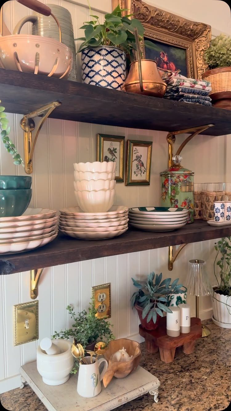
2 shelves are plenty. Dark wood shelves look best against a white backdrop like beadboard, because the contrast does the styling for you, and brass brackets add a warm accent.
Add a plant or 2 for softness. Stack dishes in mixed sizes rather than lining them up like a store display, since a slightly uneven arrangement is what makes shelves look collected.
4. Rustic Italian Kitchen
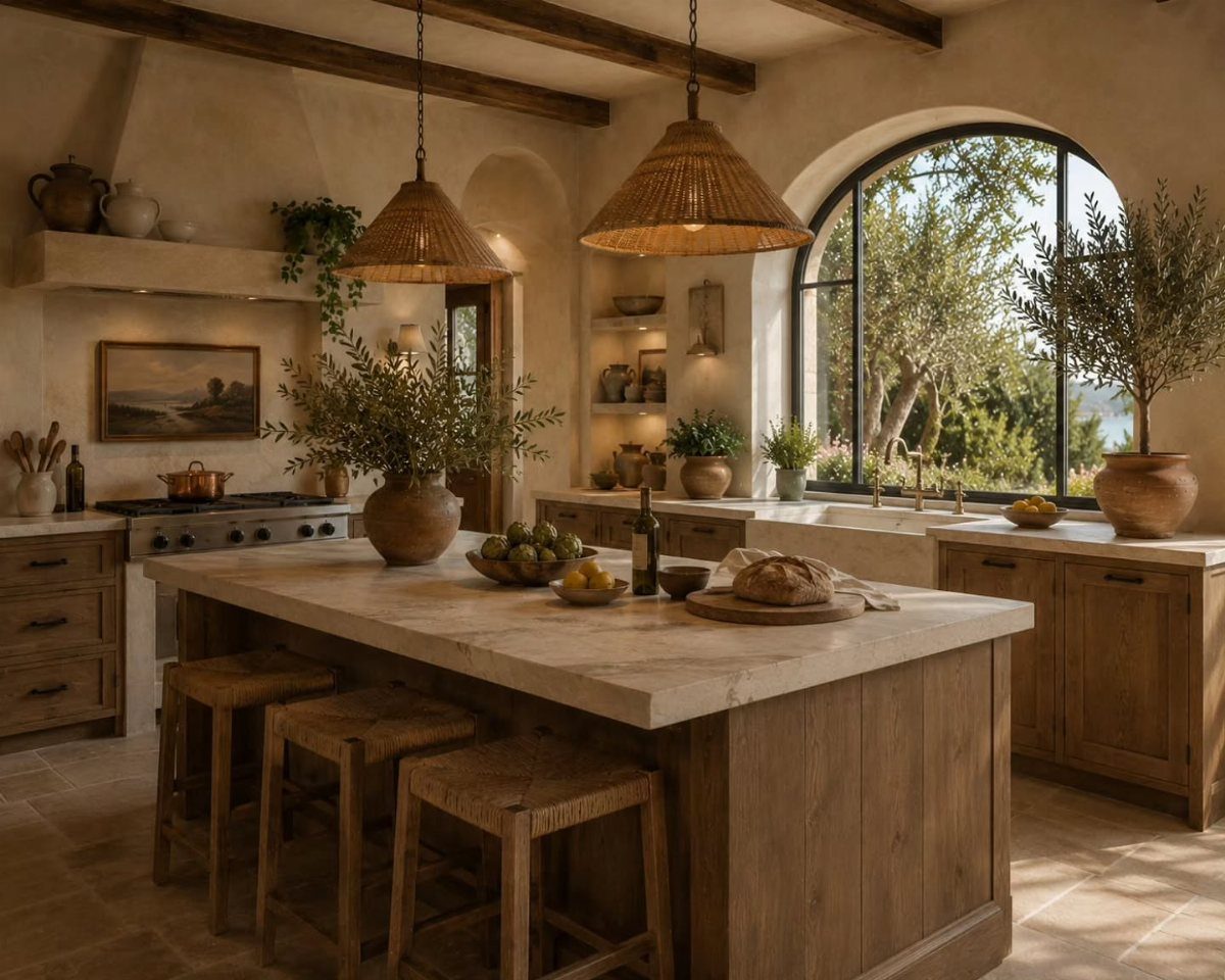
A countryside Italian kitchen depends on materials that look better with age: a stone island, wood cabinets with visible grain, woven pendant lights. Nothing here is glossy or perfectly matched, and that is the appeal.
The arched window is the piece most kitchens can’t copy. The pendants and the wood fronts are the easier moves, and they carry the look even without that view of greenery.
In Italian kitchens, such materials are commonly seen in stone floors, exposed wood ceiling beams, or countertops made of either material. But watch out for the biggest weakness of marble countertops: they’re very prone to staining.
5. Modern Italian Kitchen
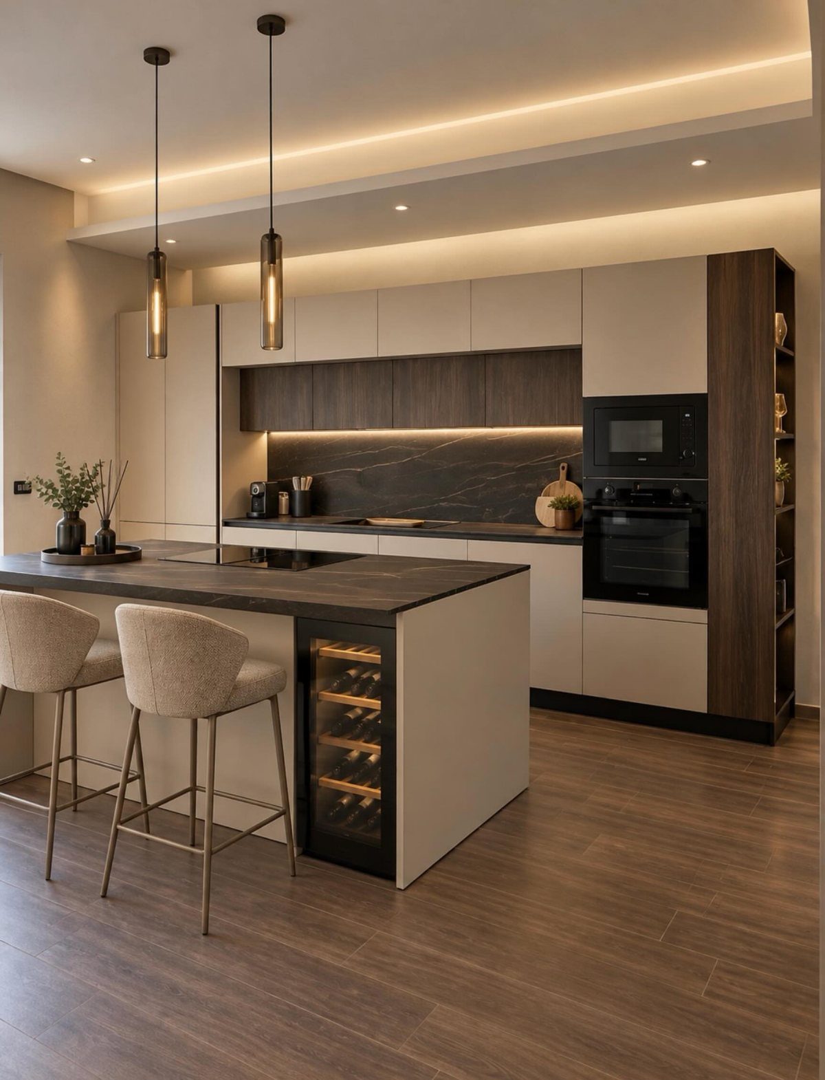
Grey, beige and wood make a calm palette, and the modern version of this look depends on restraint. A grey island, beige barstools and dark countertops sit well together because none of them asks for attention.
Appliances built in behind cabinet fronts keep the lines clean. Add warmth with wood-toned accents, and use recessed lights for general light with 2 pendants over the island as the single decorative moment.
6. Terracotta Tile Floors
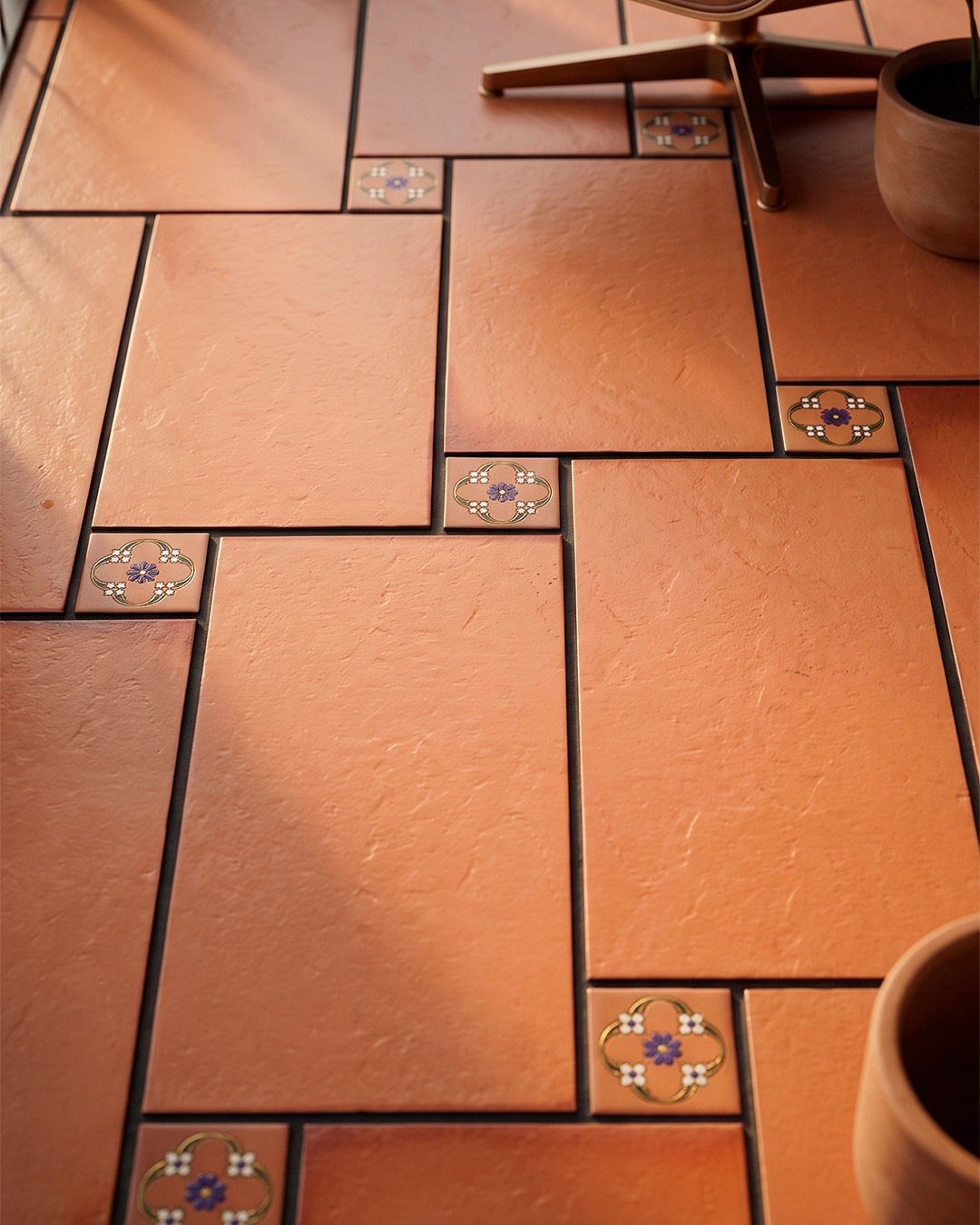
Cotto is the Italian name for terracotta tile, and it gives a kitchen a warm base that paint can’t match. Tiles vary in tone from piece to piece, which is part of the charm.
Small floral inserts work best scattered among plain tiles rather than packed in rows.
I’d keep them sparse so they read as a detail. Flooring is a big commitment, so renters may prefer a terracotta-toned rug or pots instead.
7. Farmhouse Sink
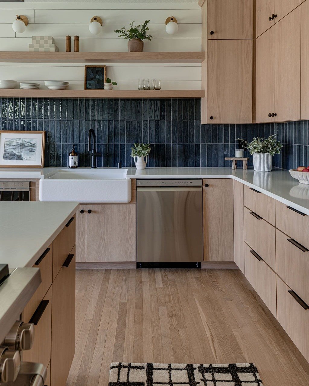
A deep, wide apron-front sink brings a countryside feel to a kitchen faster than almost any other single piece. Against dark blue tile and light wood cabinets, the white front reads crisp and a little old-fashioned in the best way.
Plan the cabinet around it, since the sink’s front sits exposed and the base cabinet has to be cut or built to fit.
That makes it a better call for a remodel than a quick weekend swap, and renters will have to skip it.
8. Ornate Chandelier
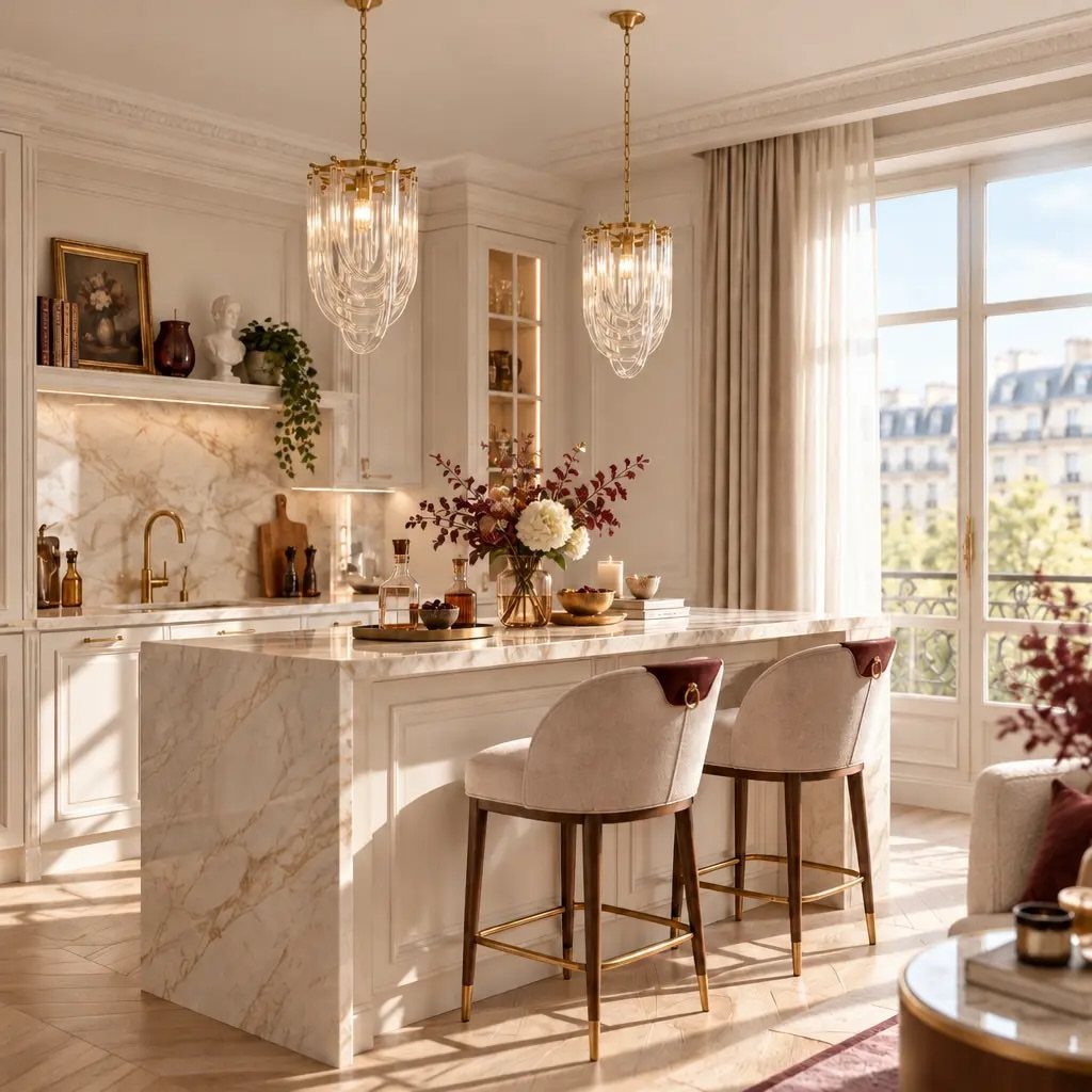
Hung in pairs over an island, crystal chandeliers turn a work surface into the room’s centerpiece. White marble and soft beige stools keep the sparkle from feeling fussy, so the fixtures can be as dressy as they like.
Give the island enough length to carry two fixtures, and center each one over its half.
A renter can get the same drama from a plug-in chandelier on a ceiling hook, with the cord tucked along the wall. A dimmer makes it easier to live with.
9. Built-in Wine Storage
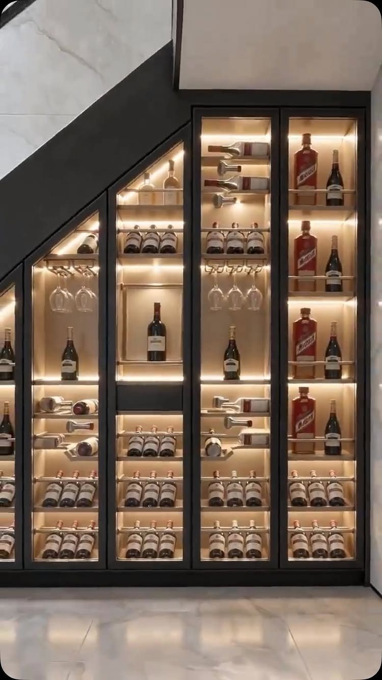
Wine belongs near the stove as much as the dining table, so a dedicated spot for bottles makes sense in an Italian kitchen.
Under a staircase is a smart place to put it: the awkward wedge of space gets a real job.
Black frames and interior lighting turn a wine rack into a display; without them, bottles tend to read as clutter.
Glass doors also let you spot the bottle you want without opening anything. I’d tuck glasses in the same unit so cooking wine and serving wine live together.
10. Kitchen Herb Garden
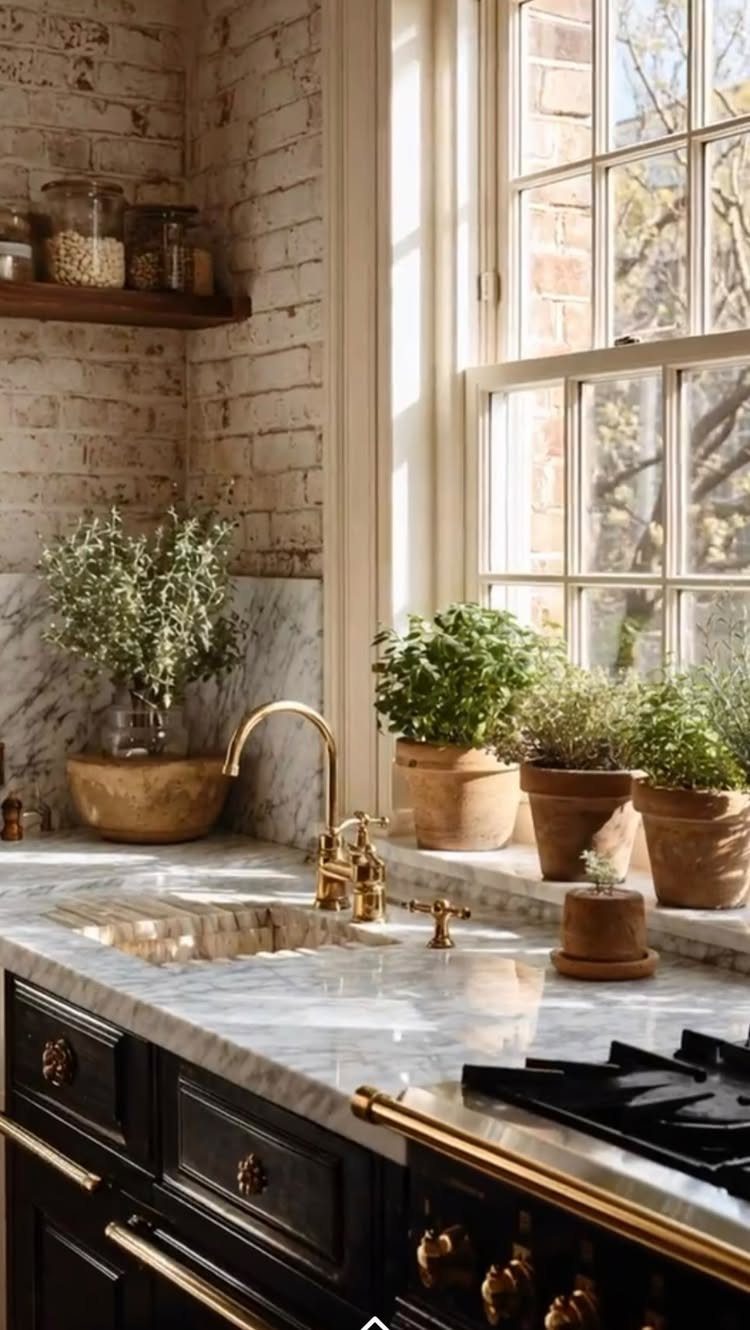
A row of potted herbs on a sunny sill puts basil within arm’s reach of the cooktop. Against white brick and marble, the green looks fresh, and the pots stay out of the way of prep space.
Use one pot per herb so each gets its own watering schedule.
Terracotta pots tie the sill to the earthy palette elsewhere on this page. This is the cheapest idea on the list, and it works in a rental because nothing gets installed.
11. Hanging Pot Rack
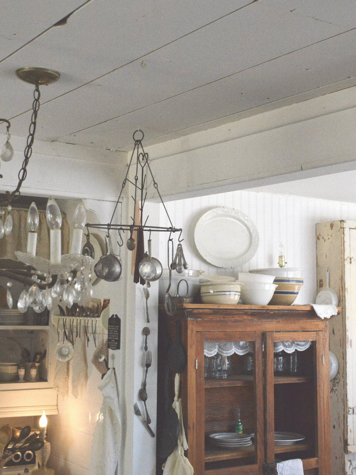
Pots on show make the cook the decoration. A metal rack overhead keeps cookware and utensils where your hand falls naturally, and in a rustic white kitchen with a wooden hutch, the metal adds a darker note.
Hang the pots you use daily and store the rest. Dusty, unused cookware looks sad up there.
Anchor into a ceiling joist, because a loaded rack is heavy. If drilling overhead is off the table, a wall-mounted rail is a lighter version.
12. Minimalist Cabinets
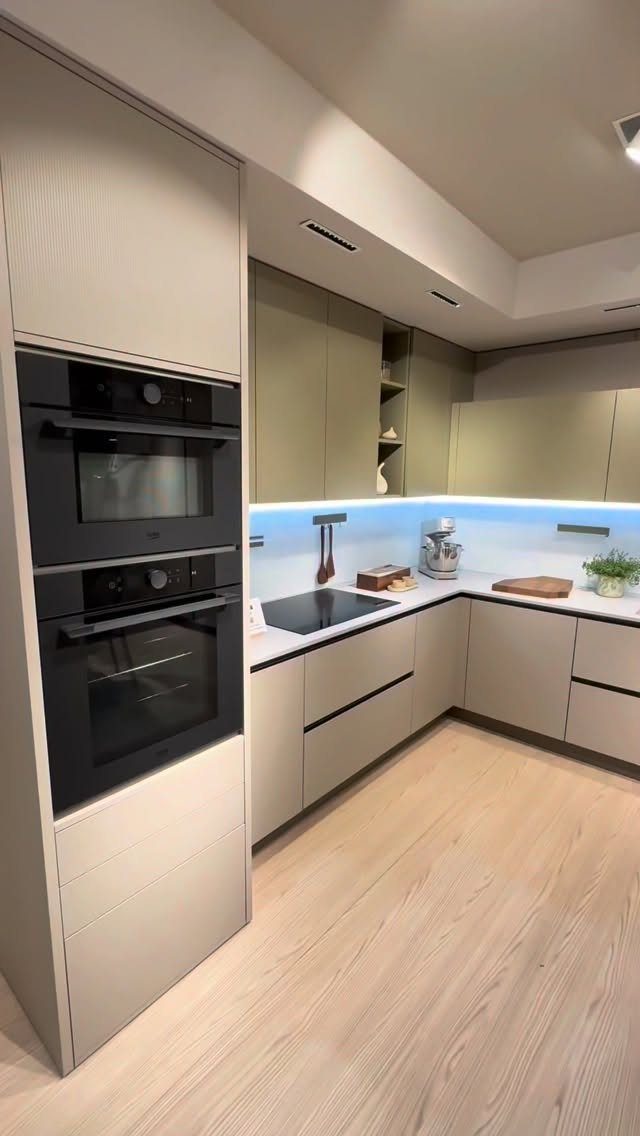
Flat-front beige cabinets with no visible clutter let the kitchen read as one calm surface. Built-in ovens set into the run make it feel even more unified, since nothing sticks out to break the line.
Go with a matte finish and handleless or very slim pulls to keep the flow.
Under-cabinet lighting does a lot of work in a minimalist kitchen, and a blue tone is a bold choice; for a cozier room I’d go with a warmer white, around 2700–3000K. The look rewards ruthless countertop editing.
13. Kitchen Island
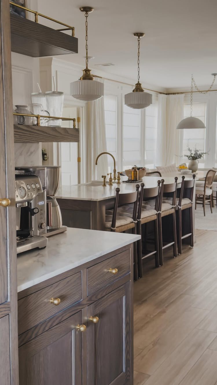
An island gives the room a spot to chop, pour coffee and let people stand around without crowding the cook. Here the marble top sits against dark wood cabinetry, and the lighter surface keeps all that wood from feeling heavy.
Hang pendants over the island’s center line, and pick gold fixtures if your hardware is already warm-toned.
A coffee maker kept on a counter near the island turns the kitchen into a morning stop, which draws people in without extra effort.
Check your floor plan before buying one. A small kitchen may do better with a rolling cart.
14. Marble Hood Surround
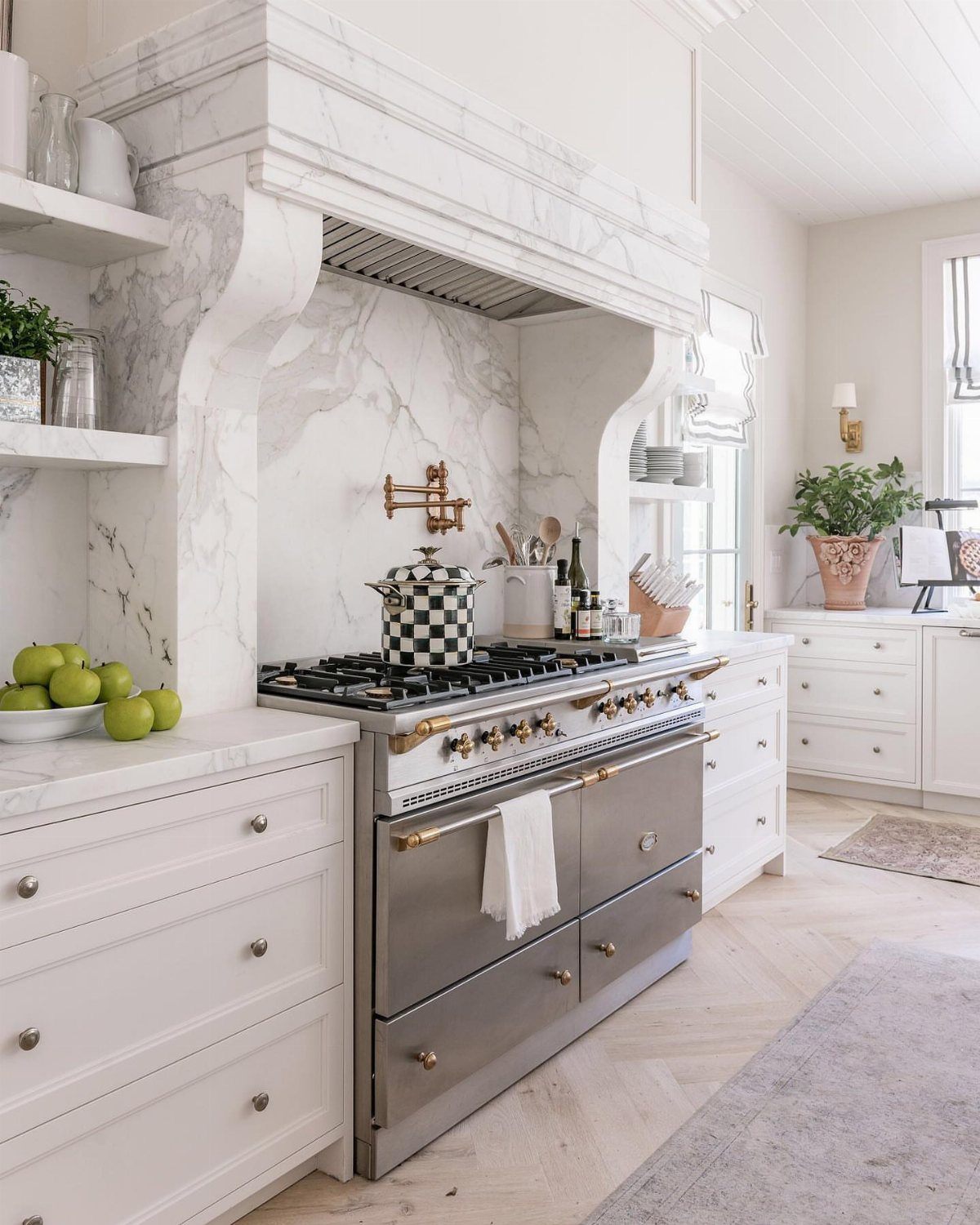
Plaster-like curves and carved detail on a marble hood make the stove wall the first thing anyone sees.
White cabinets and pale herringbone floors keep the rest quiet, so the surround gets all the attention, and that is why this version works.
A stainless professional range suits the scale of a surround this big. Smaller stoves can look lost beneath it.
Full marble is a remodel-level commitment and a heavy one. For a lighter version, I’d look at a marble-look finish on a hood cover, or a simple arched plaster shape painted white.
15. Marble Waterfall Island
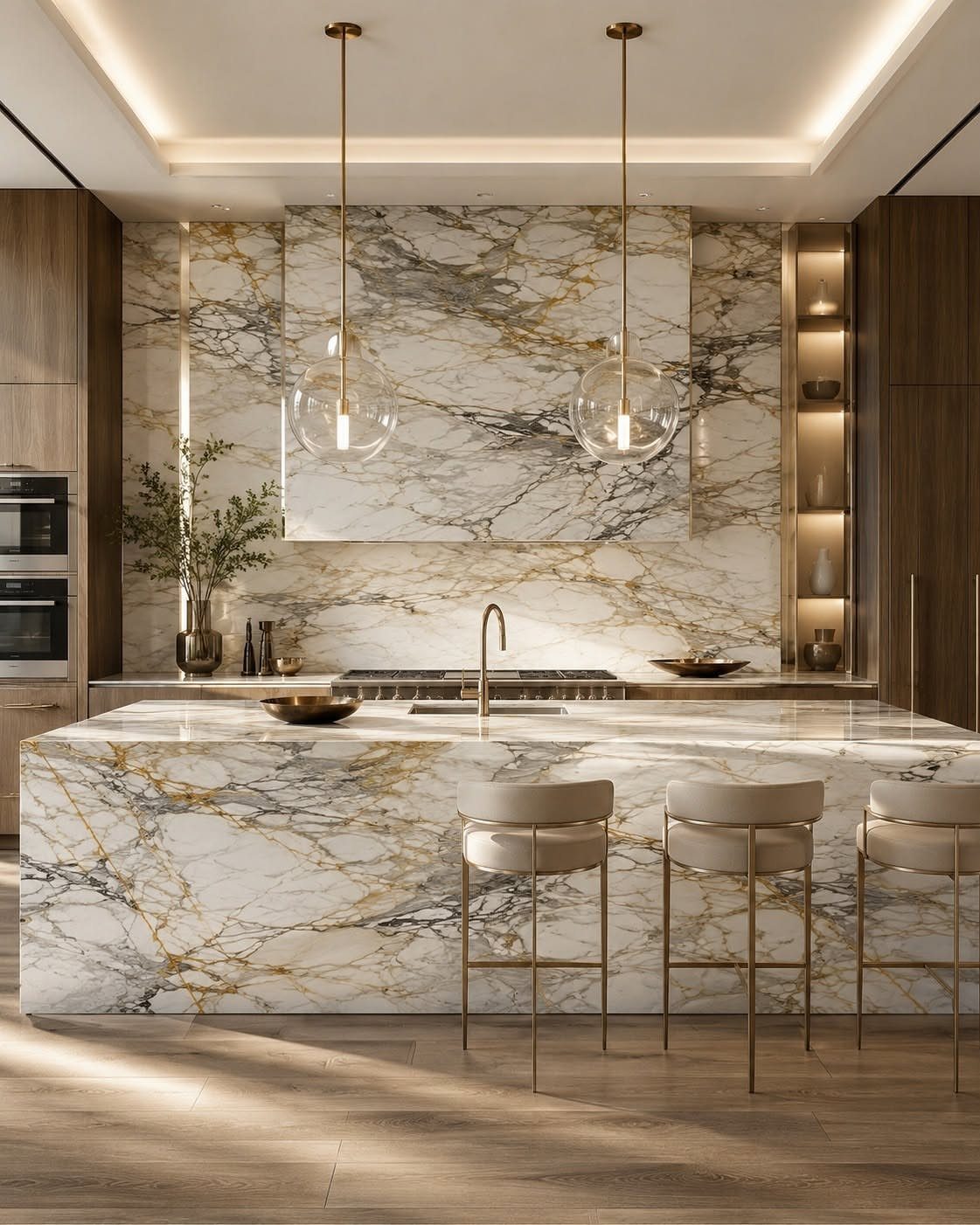
Marble that runs down the island’s sides in one unbroken sweep is what makes a waterfall edge look expensive.
Gold veining in the stone picks up the pendant lights and barstool legs, so the metal feels planned instead of added on.
Repeat the same marble on the backsplash, as this kitchen does, and the room reads as one material story against dark wood.
I would pick this over a standard island only if the budget allows, because the stone and the mitered edges are a splurge. Choose a slab with veining you love, since the sides show it too.
16. Dark Wood and Marble
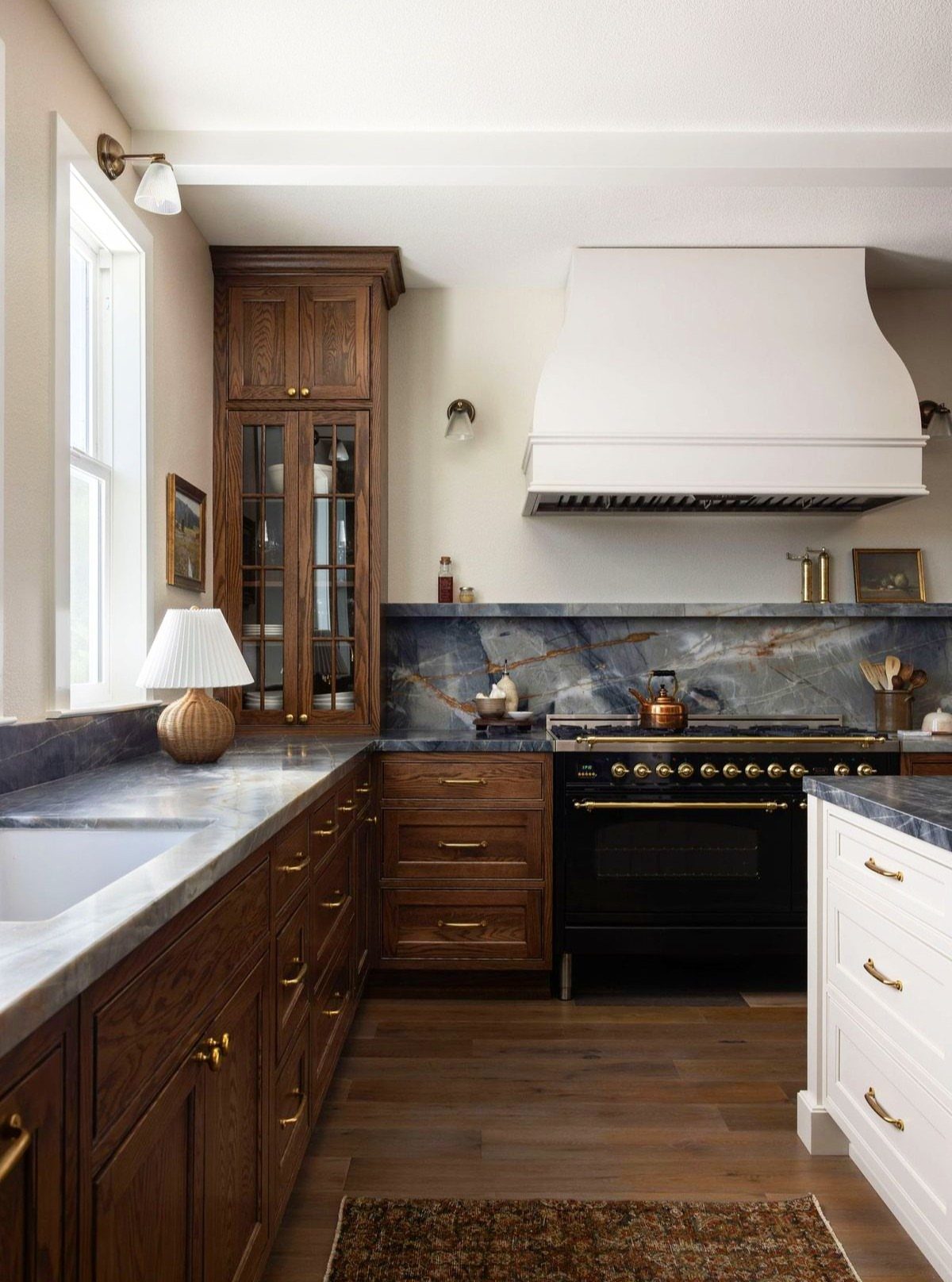
Blue-gray marble is the surprise here: it cools down a kitchen full of dark wood and gold, which could otherwise run heavy. Carrying the same stone up the backsplash as well as across the counters ties the two together.
Choose gold handles in a soft, warm finish, not bright polished brass, so they glow against the wood. A large white vent hood gives the eye a place to rest.
Ask for a sample of the marble next to your cabinet door before you commit. The blue can shift a lot under different lighting.