
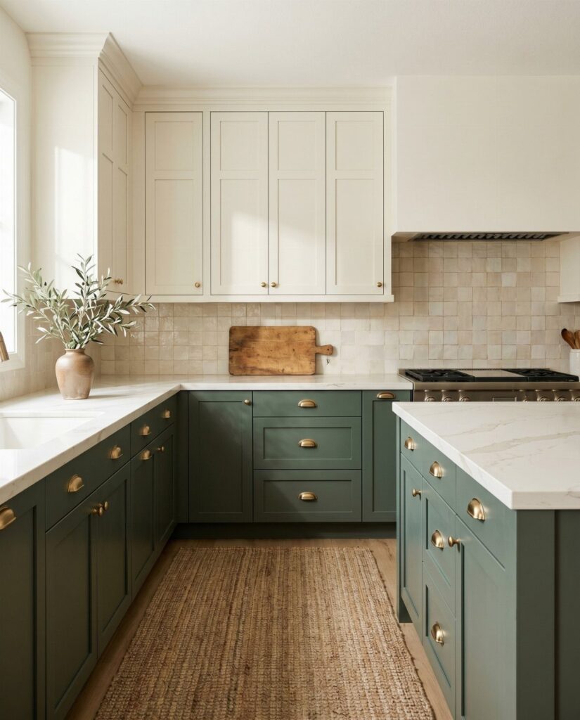

The cabinets already in your kitchen decide which of these ideas is yours. Dark wood you own points toward painting only the uppers white, while stock or painted boxes leave you free to color the lowers or just the island.
The range runs from a single navy island to walnut-look laminate on the lowers, and from pearl gray that barely reads as color to yellow paired with orange.
Whichever you pick, keep one color dominant, and a 70/30 split is the easiest ratio to start with.
1. White and Natural Wood
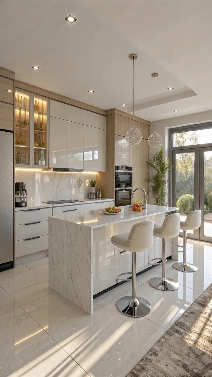
Warmth is the reason to set natural wood beside white cabinets. The white keeps the room bright, and the wood keeps it from feeling like a showroom.
Limit the wood to one zone, such as a run of cabinets or open shelving, so the white stays the main color.
I’d pick a wood with visible grain over a flat, even stain, since the grain is what makes the contrast feel organic.
2. White and Gray
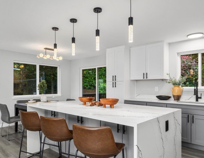
Gray lowers under white uppers is the easiest two-tone split to live with. The darker color sits low, and the wall side stays light and open.
Hold a gray paint sample next to your countertop first, especially if the stone has veining, since a gray that leans too cool or too warm will clash with it.
Painting only the lower cabinets also means roughly half the doors, which suits a weekend budget.
3. White and Navy
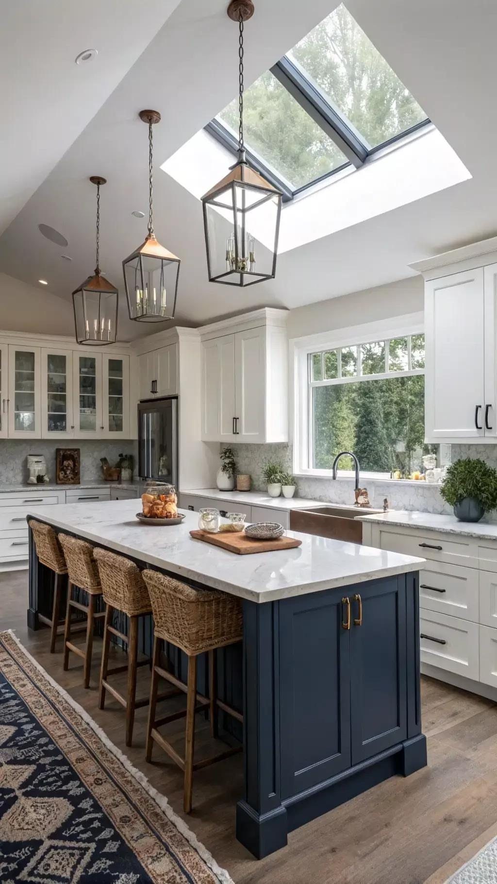
A navy island does the work of a full blue kitchen with far less commitment. Leave the perimeter cabinets white and let one piece carry the color.
Deep blue needs something warm beside it, and woven seating or natural fibers do that well. If you’re repainting, the island is a small, forgiving place to try a bold shade before deciding whether the walls of cabinets should follow.
4. White and Sage Green
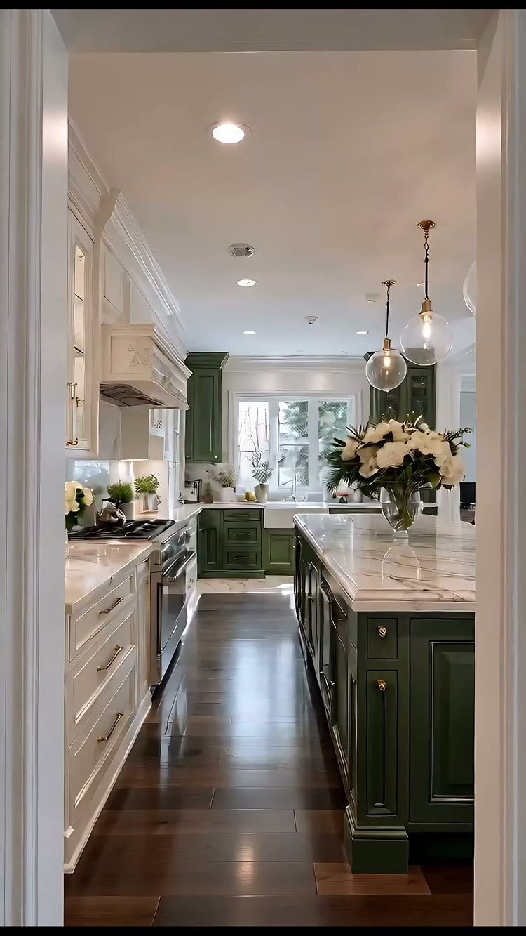
Sage is a muted green with enough gray in it to behave like a neutral, which is why it pairs so easily with white.
Sage works best on the lower cabinets and island, with white uppers so the room stays airy.
Choose a sage that looks soft on a sample door in your own light, not just on a paint chip. Dark floors and marble tops, as in this kitchen, give the green something grounded to sit against.
5. Dark Wood and White
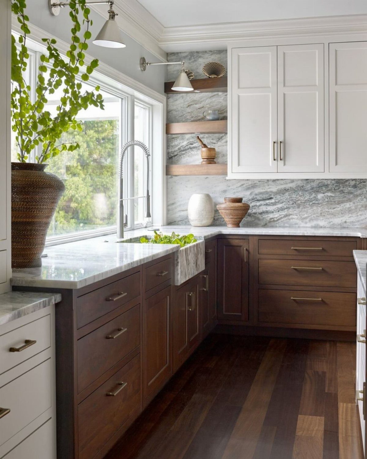
Dark wood below and white above gives a kitchen definition without making it heavy. Keeping the dark tone low leaves the upper walls light.
A pale countertop bridges the 2 halves, and a farmhouse sink suits the traditional feel of stained wood.
If you already own dark wood cabinets, painting only the uppers white is the cheapest way to get this look, and it avoids refinishing the lowers.
6. Black and Wood
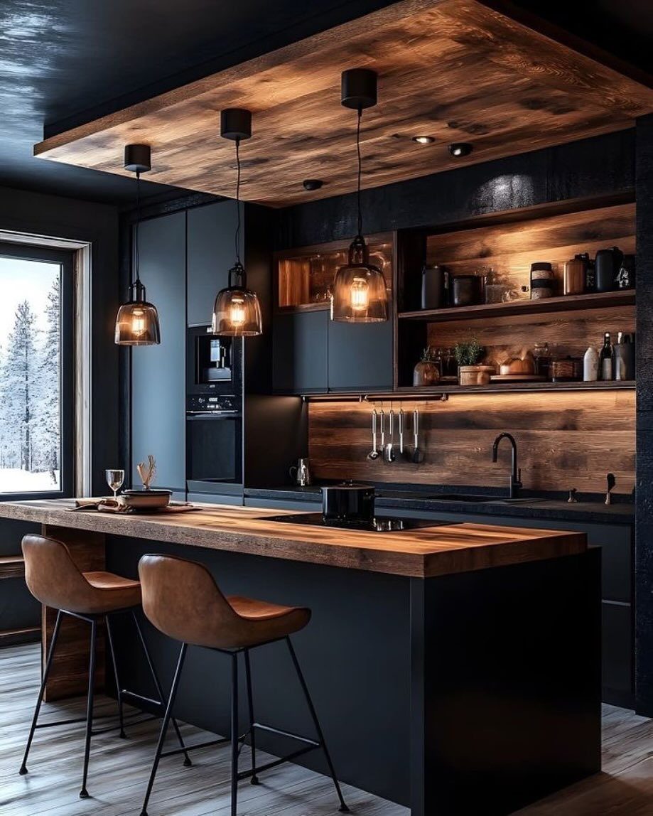
Matte black cabinets need wood nearby, or the room starts to feel like a cave. A thick wood countertop, a shelf or two, even a wood ceiling panel: each one breaks up the dark with texture.
I’d lean toward a medium or warm wood tone rather than a near-black one, so the two materials stay distinct. Layered pendant lighting matters more here than in a white kitchen, since a dark palette depends on it.
7. White and Green
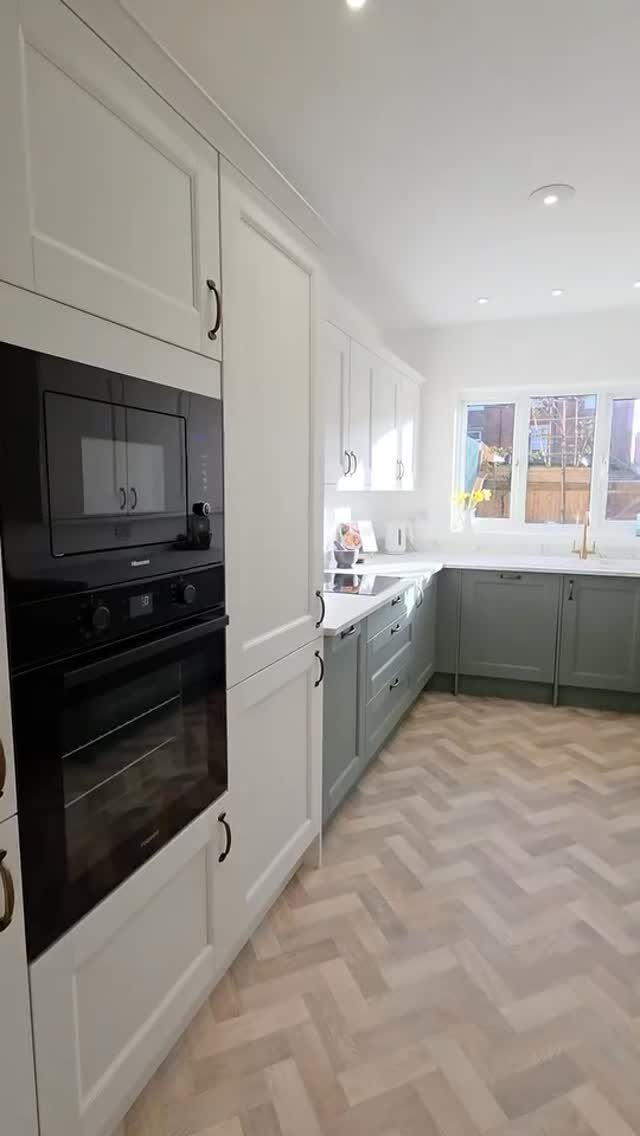
Sage lowers under white uppers and tall cabinets give this kitchen its calm, and the herringbone floor keeps all that softness from going flat.
Green has a wide range, from dusty to vivid, so a bolder shade would make the lowers the focal point.
I’d stay in the soft end if the oven wall is also white, since 3 big surfaces can crowd each other. Test the green on a sample door beside the flooring before you commit.
8. Gray and Charcoal
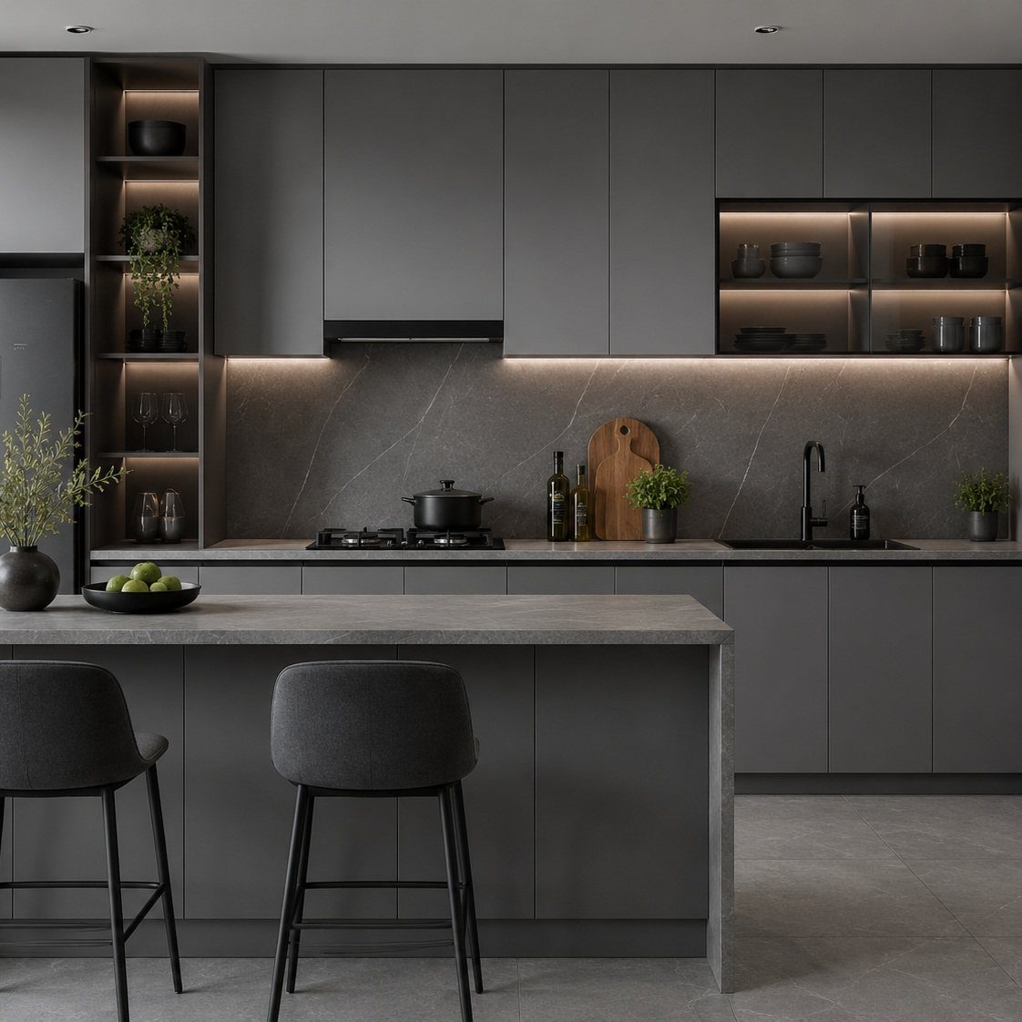
Charcoal on the perimeter and a lighter gray island keep a gray kitchen from reading as one flat block. The island steps the color up a notch, and the stone backsplash carries the same family.
Matte finishes suit this palette; the dark barstools repeat the charcoal so the island doesn’t feel disconnected. I’d keep every gray on the same undertone, warm or cool, because mixed undertones look like a mistake rather than a layer.
9. Blue and Brown
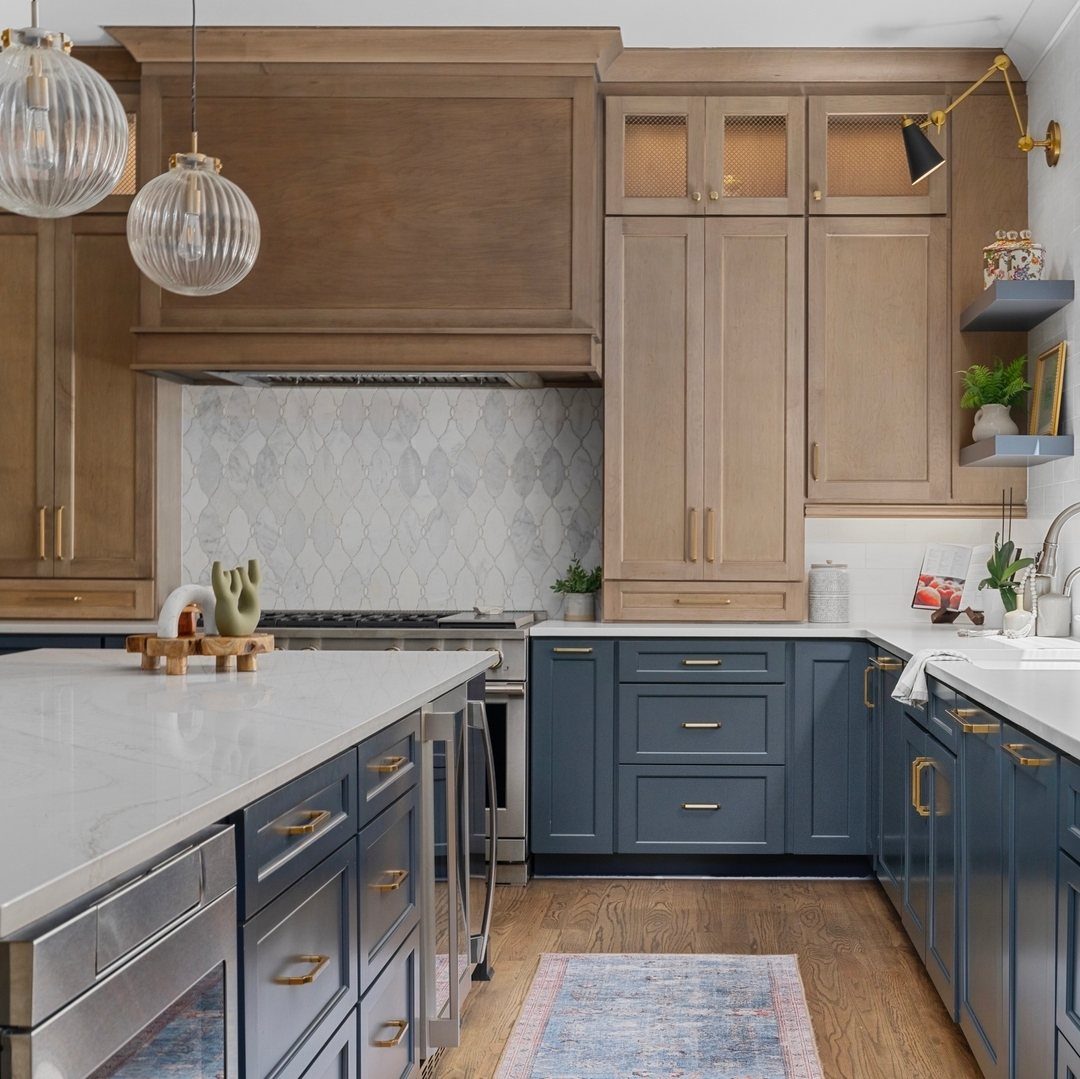
Navy lowers and warm brown wood uppers set cool against warm, and the brown hood ties the 2 halves together. White counters and a marble backsplash give both colors a quiet place to rest.
Pick a wood with chestnut or honey in it rather than a gray-brown, since the warmth is what makes the blue look rich.
Already have wood uppers? Painting just the lowers navy gets you this look for the price of a gallon of cabinet paint and a weekend of work.
10. Green and Cream
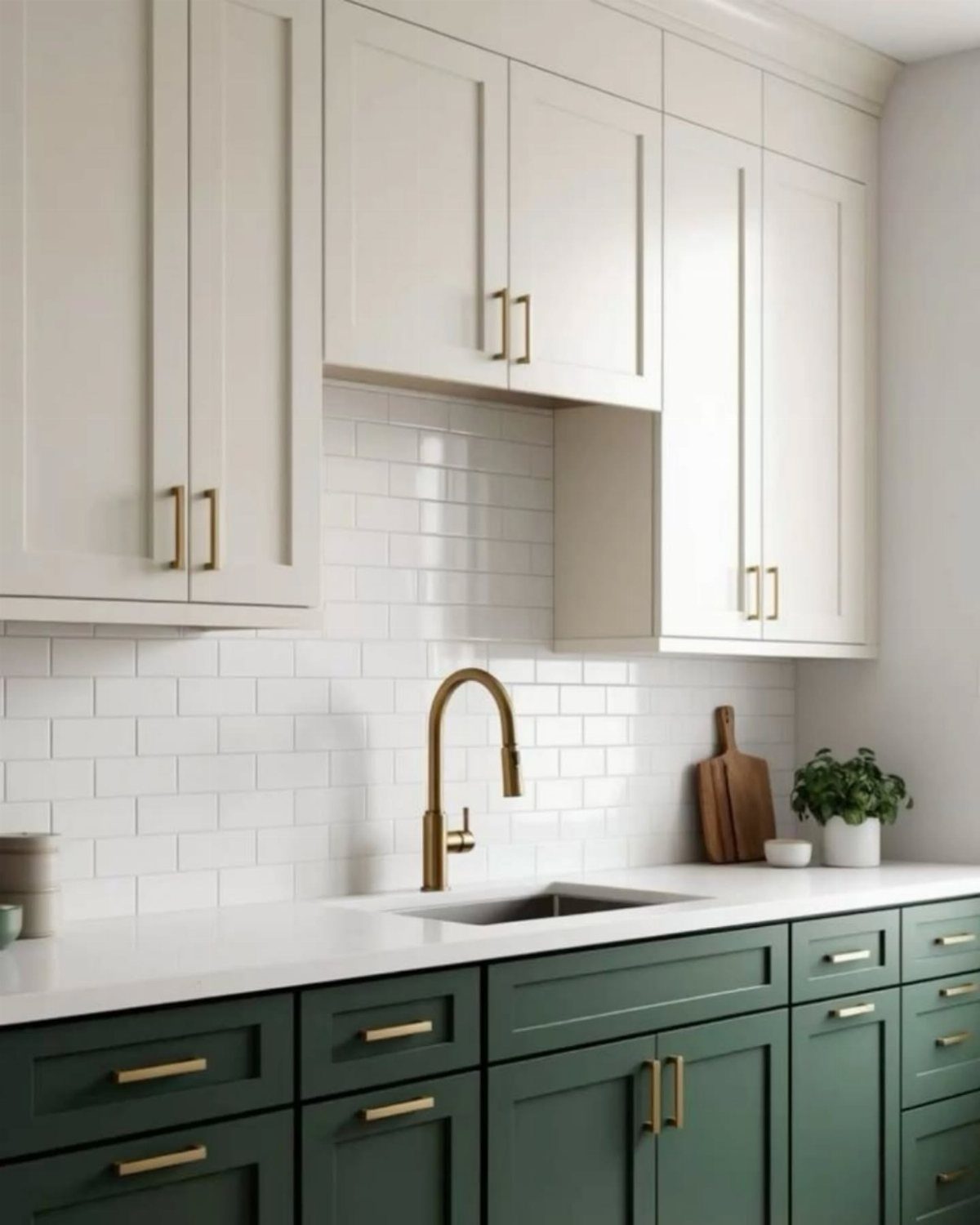
Dark green below and cream above reads like an older, softer kitchen, and gold hardware plus a gold faucet finish the warm tone. Cream is kinder than stark white next to an earthy green, which can make white look cold.
I’d match the gold across the faucet and pulls so the metal looks planned, not collected.
11. White and Walnut
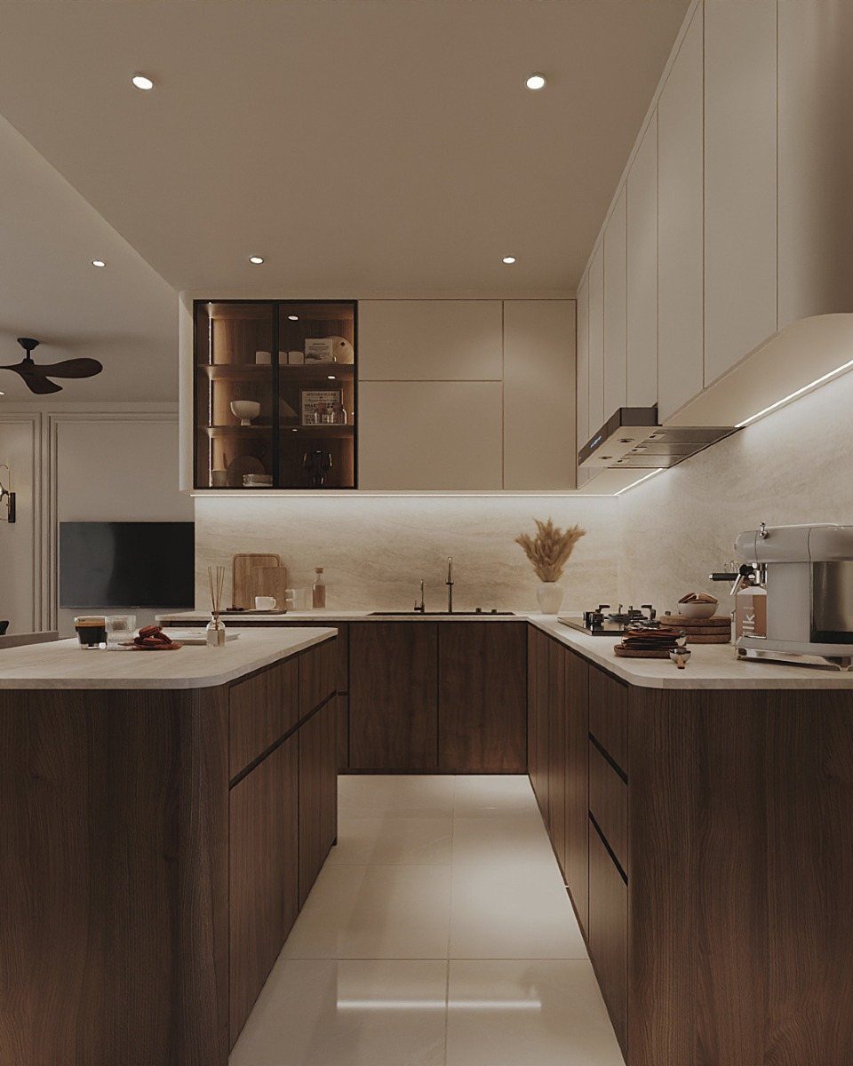
Flat-front white uppers against walnut lowers and a walnut island make a clean, modern split, with the wood supplying all the richness. Slab doors have no profile to fuss over, so the grain does the talking.
Running the walnut to the island ties the room together.
A white countertop keeps the dark wood from weighing on the space. For a budget version, walnut-look laminate or veneer on the lowers gets you close.
12. White and Blond Wood
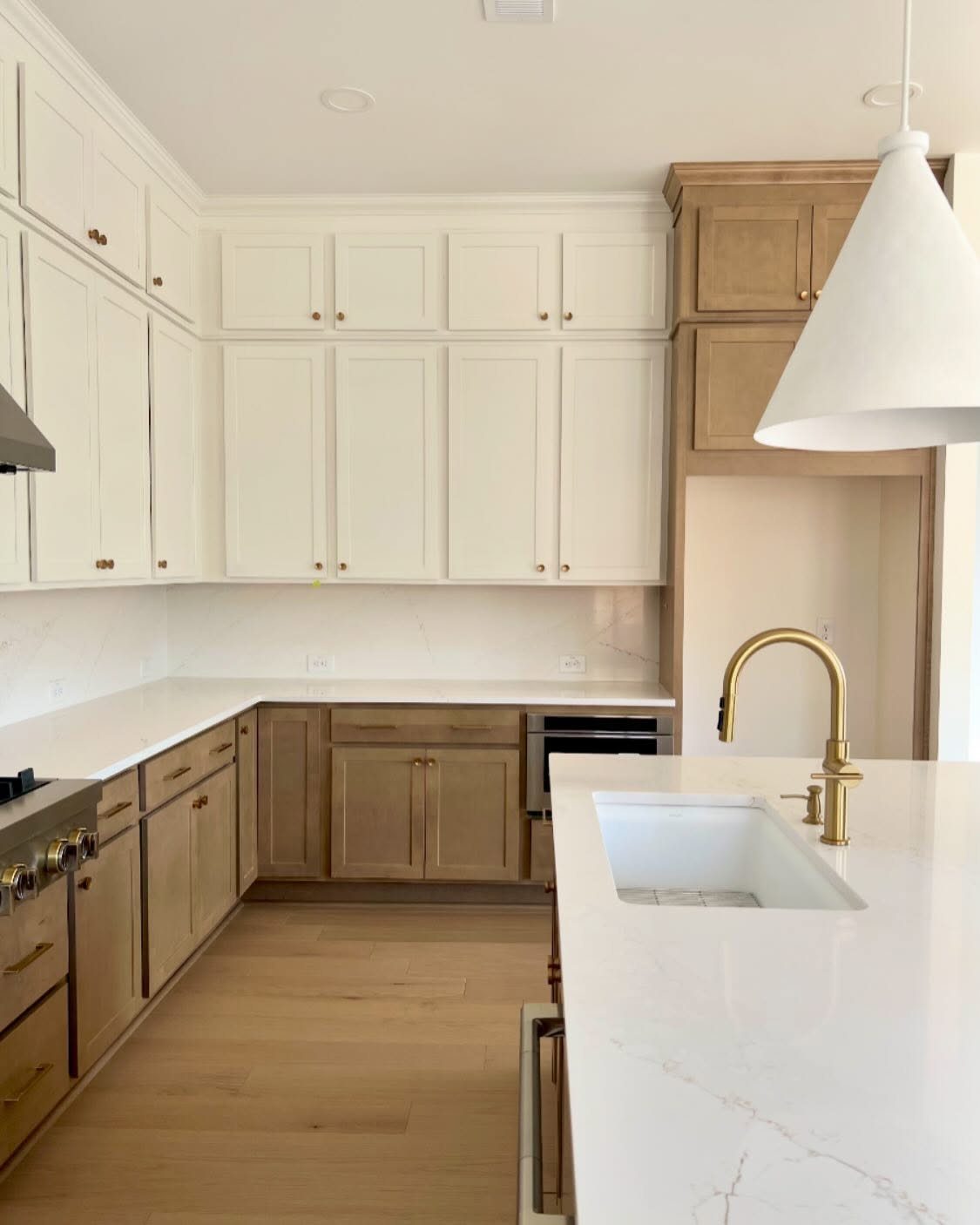
Blond wood lowers under white uppers is the softest way to mix wood and paint, and if you wrap the refrigerator surround with matching wood, the appliance looks built in.
White counters and light flooring keep the kitchen feeling airy instead of boxed in.
A gold faucet adds a little warmth without competing. I’d choose one blond tone and stay with it, because two near-matching woods side by side usually look like an accident.
13. Pearl Gray Cabinetry Within a Black-and-White Space
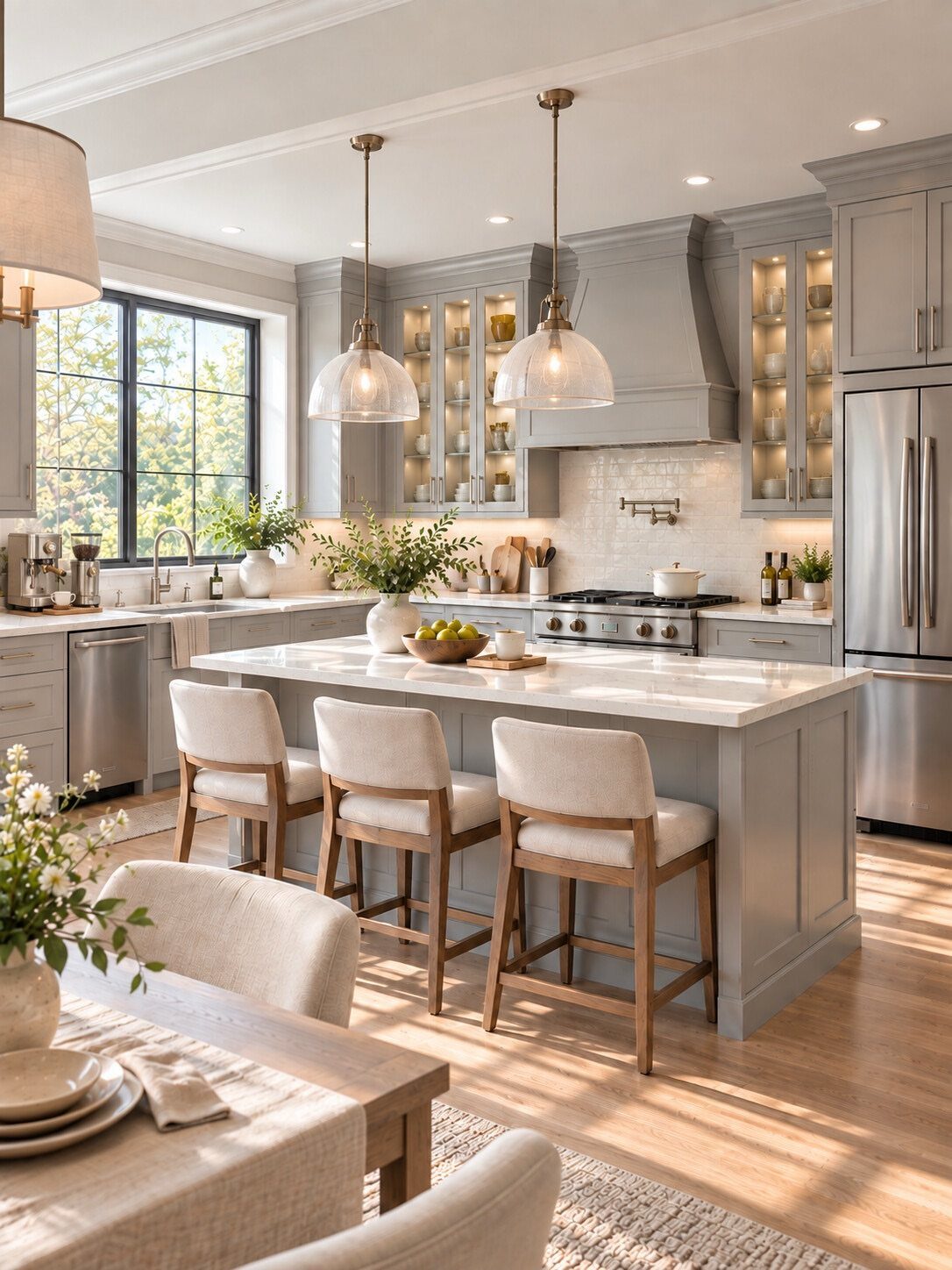
Barely there, pearl gray reads as shading more than as a color. Put it on one block of cabinetry and let the white around it stay the main event.
Hold a sample against your white walls before buying, since pearl grays can lean slightly warm or cool. Beige barstools and a wood table, as in this kitchen, keep a pale palette from going chilly.
14. High-Gloss White and Light Matte Wood Cabinets
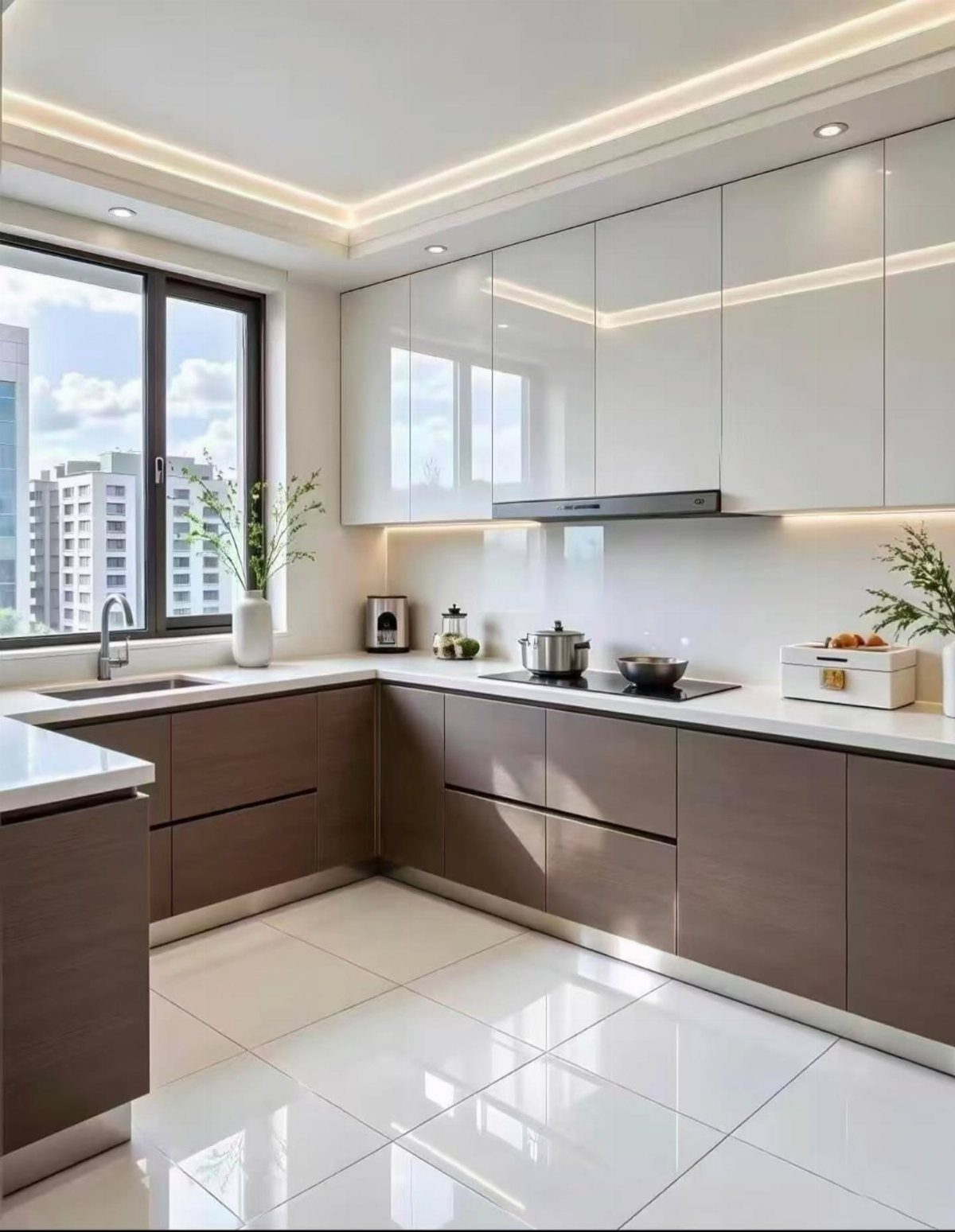
Sheen is the real contrast here. High-gloss white uppers catch light from the window, while matte wood lowers sit quietly underneath.
Gloss belongs up top and matte below: that way the wood stays soft and the shiny uppers don’t fight it for attention. White counters and a white tile floor give the wood room to be the one warm note.
15. Sunny Yellow and Glowing Orange Cabinets
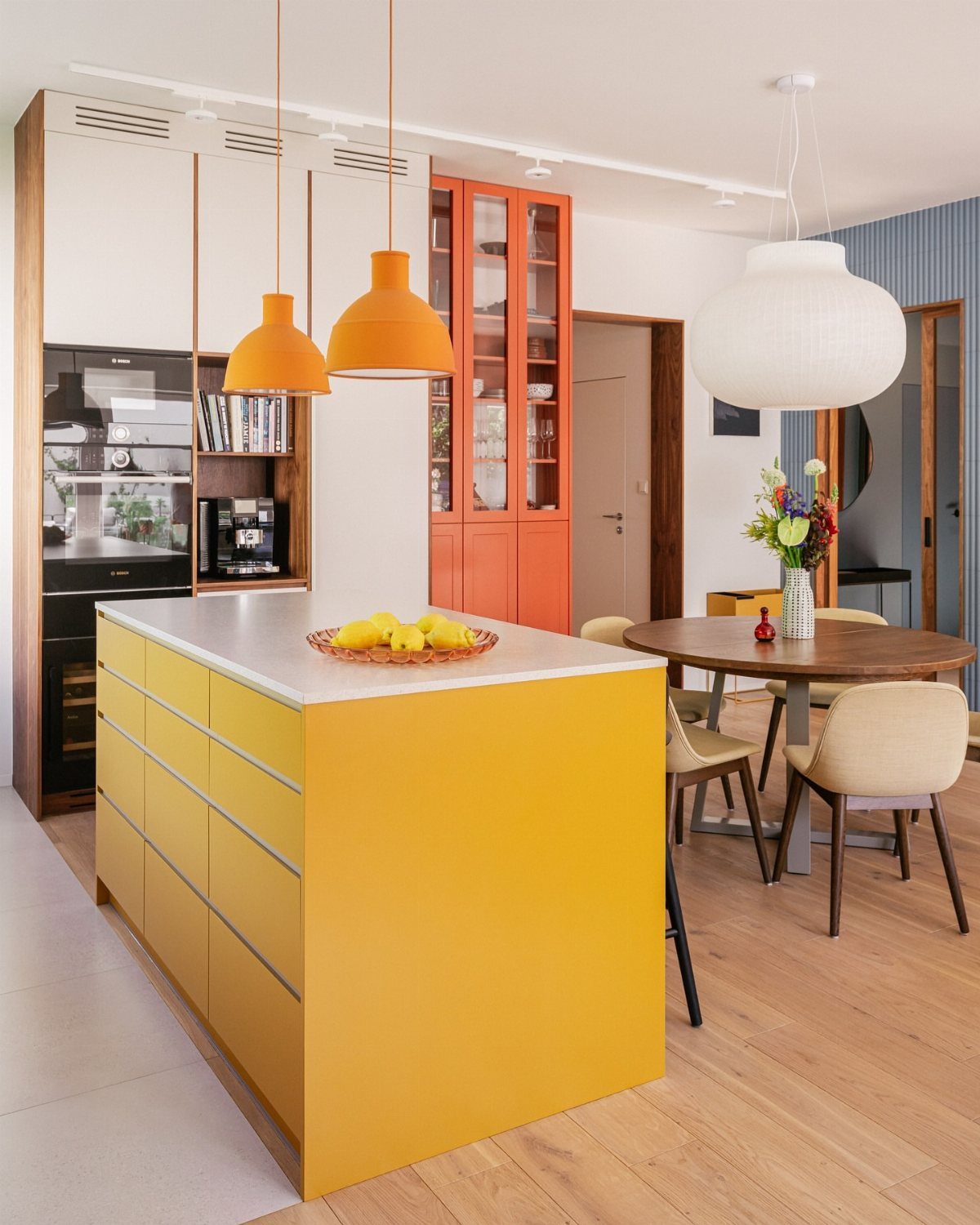
Put yellow next to orange and the kitchen lands in retro, midcentury territory almost immediately. Give each a different job: the island takes the yellow, and the glass-front orange cabinets add a glow.
If you’re nervous about the color, paint the island first. It’s one piece, and you can judge the yellow in your own light before committing further.
16. White and Taupe Brown
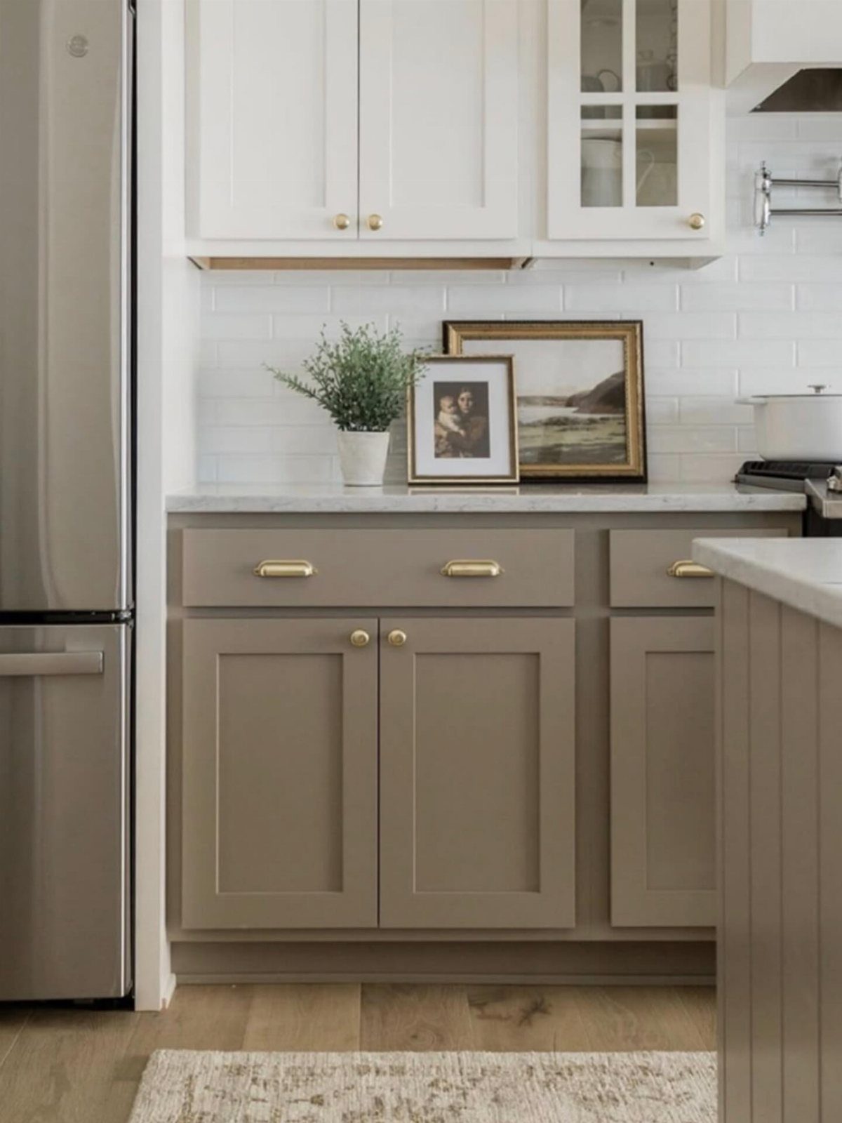
Gold pulls are the cheapest part of this look, and they change the most. Taupe-brown lowers under white uppers are a gentle dark, softer than navy or black, and gold hardware gives them a finished edge.
Hardware is also the easy first step if you’re repainting in stages. Gold works best limited to the handles, which leaves the stainless refrigerator free to read as its own cool metal.
17. Beige and Dark Wood
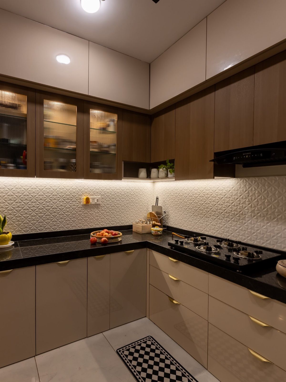
Dark wood uppers over beige lowers flip the usual rule, and fluted glass is what makes the flip work. The glass-front sections break up the heavy wood so the top half doesn’t loom.
Black countertops echo the dark uppers, while the textured white backsplash supplies the light between them. I’d use glass on at least a few doors rather than all solid, so the wood reads as a feature.
18. Olive Green and Beige
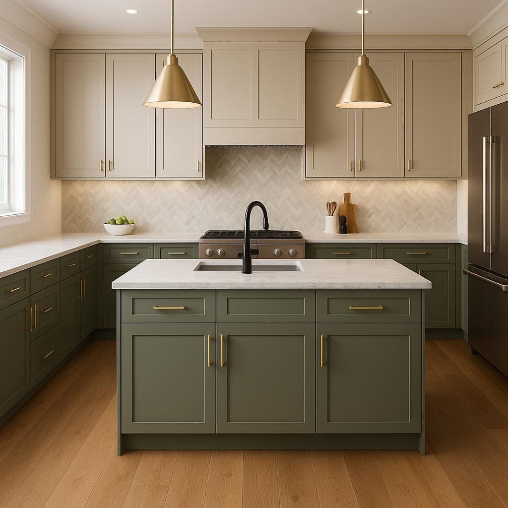
Olive carries more brown than most greens, which is why beige uppers suit it better than stark white would. Olive suits the lowers and island best, while the wall cabinets stay light.
Gold pulls and gold pendants repeat each other across the room. White counters and light wood flooring give the olive a bright place to stop, and I’d sample the green on a door before painting every cabinet.
19. Pink and Mauve
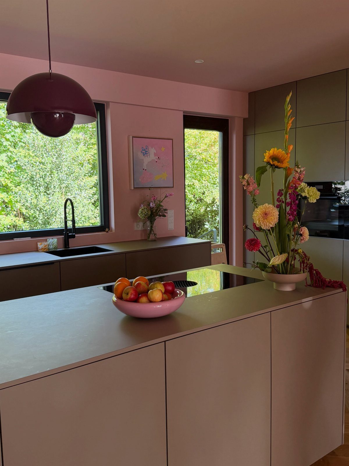
Light pink on the island and a deeper mauve on the lowers give a pink kitchen some depth, so the room doesn’t read as one sweet block.
The island is the lighter piece and the mauve sits beneath it as the anchor.
Pink this strong needs one dark accent to keep it grown-up, and the burgundy pendant does that. Paint a sample door and check it at night, since pink can shift a lot under warm bulbs.
20. Gray and Navy Island
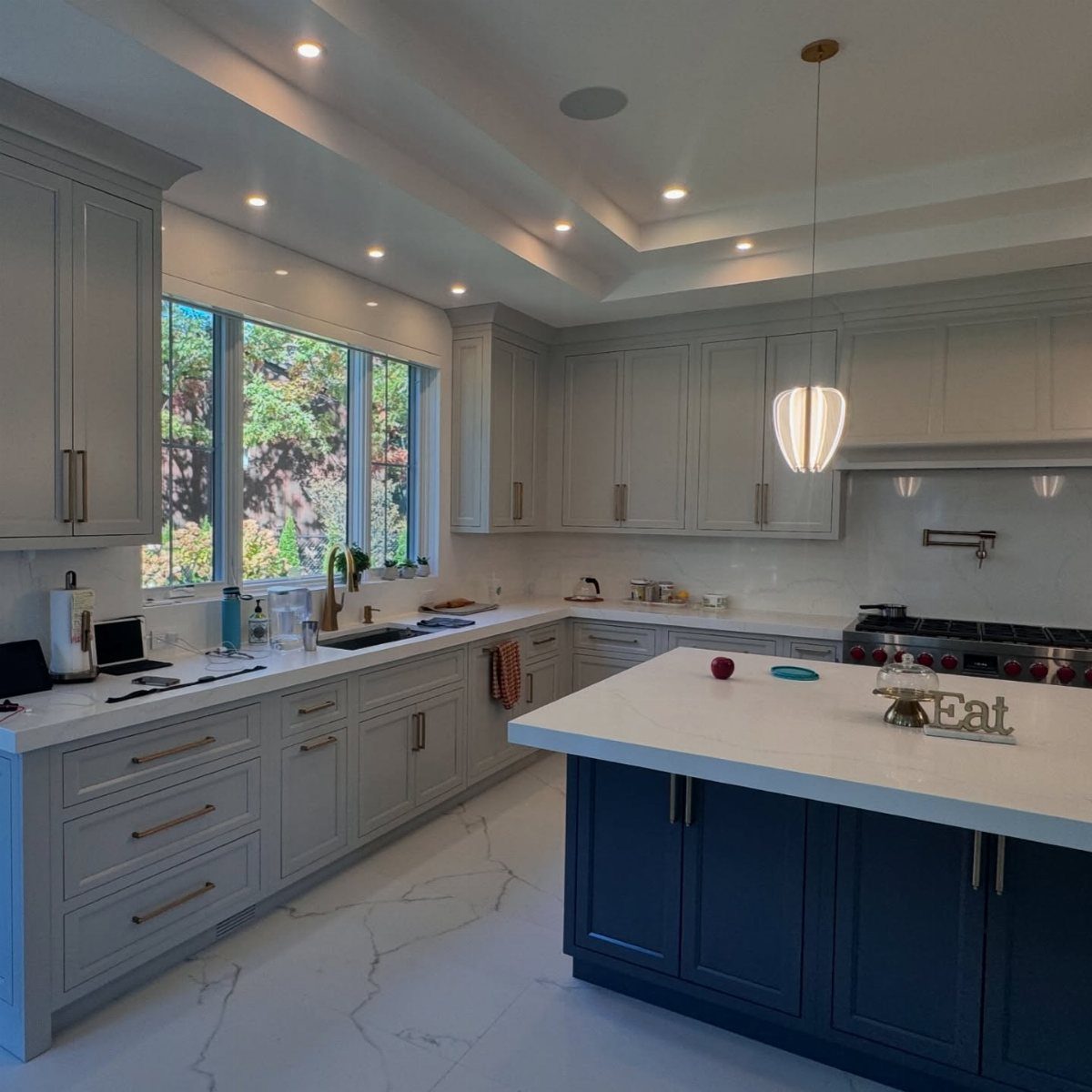
Light gray all around the perimeter with a navy island is a safe way into two-tone. The gray stays quiet, and the island takes the color.
A white countertop on the island keeps the navy from feeling heavy, and light walls do the same job around it.
If you’re repainting, start with the island alone: it’s one piece, and you can see how much navy you like before touching anything else.
21. White and Blue Island
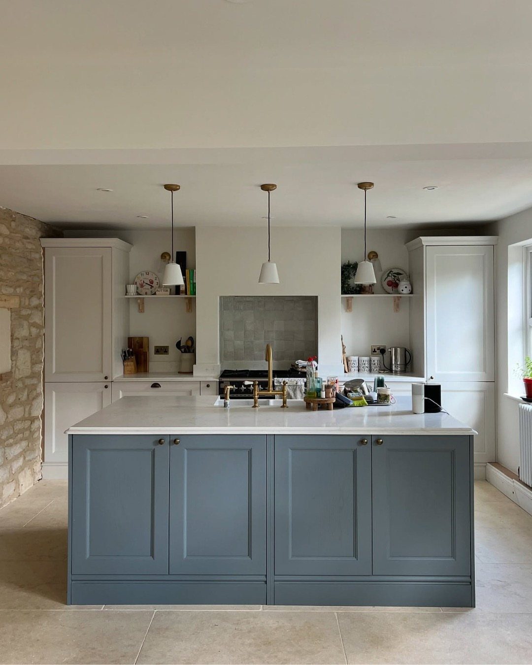
Bright rooms handle a blue island better than dim ones, because daylight keeps the color clear instead of letting it turn murky. White perimeter cabinets stay out of its way.
3 pendants over the island repeat its line, and the stone wall adds texture the painted cabinets can’t.
Placement and Focal Points
Two tones can divide a kitchen four ways: upper against lower, perimeter against island, one side of the room against the other, or one zone against the next.
Upper and lower is the split most rooms handle best, since lighter uppers make the space feel brighter and taller while darker lowers ground it.
Whichever split you pick, give the contrast one job.
Paint just one spot in the bolder shade, either the island or the wall around the range, and the eye lands there first; if both get the color, they pull against each other and the kitchen loses its anchor.
For an island, deep green and navy are strong choices, and walnut adds warmth if you’d rather skip paint. Metallic finishes or charcoal accents push it in a modern direction.
Choosing Colors and Proportions
Undertones decide whether 2 colors get along. Match the undertones of both colors, warm with warm and cool with cool, and compare each sample against the walls, floors, counters, and hardware it will sit beside.
Test every sample in the kitchen itself, at different times of day, because the light in that room changes what a color does.
Proportion gives you a real choice between 2 common rules. A 70/30 cabinetry split keeps one color dominant and the other in support, while a 60-30-10 palette adds a third, accent color on top.
I lean toward 70/30 for a first two-tone kitchen because it asks for fewer decisions. Go with 60-30-10 if you already know where the accent will live, such as hardware or a backsplash.
Budget and Existing Cabinets
A well-chosen pair of colors can make ordinary stock cabinets look pricier than they are, and it costs about the same as a gallon or two of good cabinet paint.
Your existing cabinets may already be most of the project. Refinishing or repainting what you have costs far less than replacing it, and a contrasting finish on a select area, like the island, creates the two-tone effect.
If something does need replacing, swap only the island or one section and leave the rest. Mixing stock cabinet colors is another way to avoid custom pricing.
You can also stage the work: one section now, the next when the budget allows, instead of replacing all the cabinetry at once. Pick both colors for the finished kitchen first, so each stage fits the plan.
Frequently Asked Questions
What defines a two-tone kitchen?
In a two-tone kitchen, the cabinets come in 2 colors or finishes instead of one shade running through the whole room. Most often the line falls between the uppers and lowers, or between the island and the cabinets along the walls.
Some kitchens divide by zone or by side of the room instead, though upper-versus-lower is the arrangement most spaces handle best.
Are two-tone kitchen cabinets still in style?
Yes, and they hold up better than most single-color choices because the contrast can be dialed up or down to suit almost any kitchen style.
Neutral pairings like white and gray or white and wood age particularly well, since the combination relies on proportion and undertone rather than a trend color.
Bolder pairings like navy or black on the island work the same way when the perimeter stays quiet.
Are two-tone kitchens timeless?
The concept has real staying power when the 2 colors share complementary undertones and suit the home’s broader palette. Neutral tones, natural wood finishes, and classic cabinet profiles hold their ground longest.
A trendy accent color on the island is easier to repaint later than a full kitchen, which gives two-tone layouts more flexibility over time than an all-over statement color.
Which cabinet color should be darker, upper or lower?
Darker lowers and lighter uppers is the standard arrangement, and it works because darker lower cabinets visually ground the space while lighter uppers reflect light and keep the wall side open.
Flipping that rule, as with dark wood uppers over lighter lowers, can work when glass-front doors break up the upper cabinets so the top half doesn’t feel heavy.
Do two-tone kitchens work in small spaces?
Light upper cabinets are one of the more reliable ways to make a small kitchen feel taller and more open, so a two-tone split can actually help a tight room more than a single dark color would.
The arrangement to avoid in a small space is dark on both halves, since that closes the room in from every direction.
Keeping the uppers white or a soft neutral and putting any darker or warmer tone below keeps the ceiling side from pressing down.
How do I know which colors work best together?
Undertones are the deciding factor: warm pairs with warm and cool pairs with cool, and a mismatch there will read as a mistake rather than a choice.
Set a sample of each color next to your countertop, floor, and wall paint, then check them in morning and evening light, since the same shade can look warm at 9 a.m. and grayer by dinnertime.
A stone countertop with veining is especially unforgiving of a gray that leans the wrong direction.
Do two-tone kitchen cabinets cost more than single-color cabinets?
Not necessarily. Repainting existing cabinets in 2 colors costs roughly the same as repainting them in one, and a contrasting finish on just the island or lower cabinets uses less paint than a full repaint.
Where cost rises is if replacing cabinetry, since different door styles or finishes on different sections can add up.
Staying within stock cabinet lines and limiting the swap to one zone, like the island, keeps the project close to a single-color budget.
Can two-tone cabinets work in a traditional kitchen?
Wood tones paired with cream or warm white are a natural fit for classic and transitional kitchens, and the contrast stays soft enough that the room reads as one cohesive space rather than 2 competing halves.
Yes: warm wood tones paired with cream or white read as classic, and a brown-and-white split with a lighter countertop gives the room a traditional air while keeping it current.
Are two-tone cabinets hard to maintain?
Maintenance runs about the same as a single-color kitchen. Regular cleaning keeps both finishes in good shape, and neither color needs treatment the other doesn’t.
The one practical note is that very dark lower cabinets show fingerprints and scuffs more readily than light ones, so a matte or satin finish on the lowers holds up better in daily use than a high-gloss dark.
Which color combinations work best for two-tone kitchen cabinets?
White paired with a second color is the most adaptable starting point: white uppers with gray, navy, sage green, or natural wood lowers each read differently but all follow the same logic of a light top half and a grounded lower half.
For something less expected, navy lowers under warm wood uppers or olive green lowers under cream uppers work well when the 2 colors share a warm undertone.
A 70/30 split, where one color covers the larger share of the cabinetry, keeps the room from feeling divided.